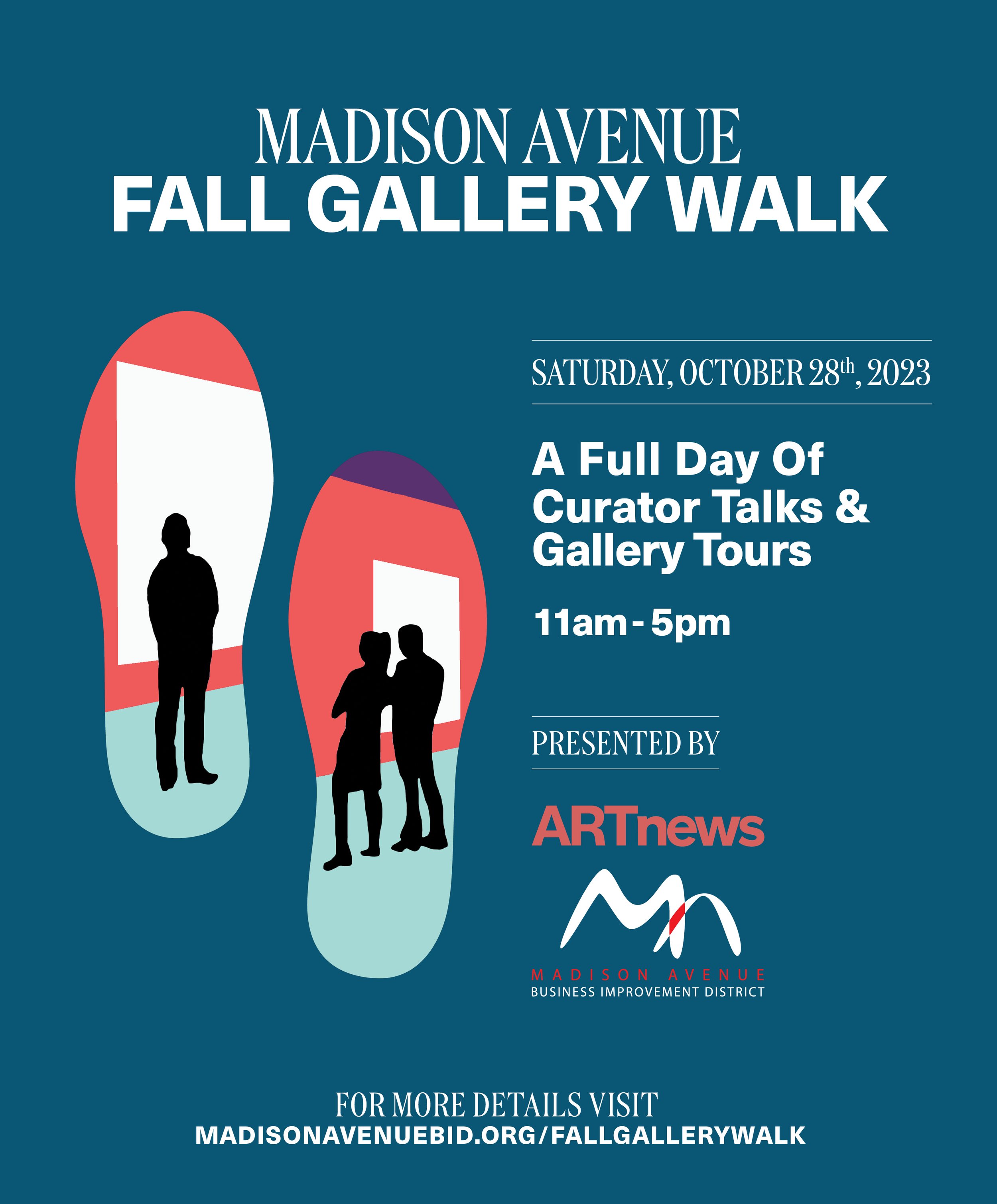
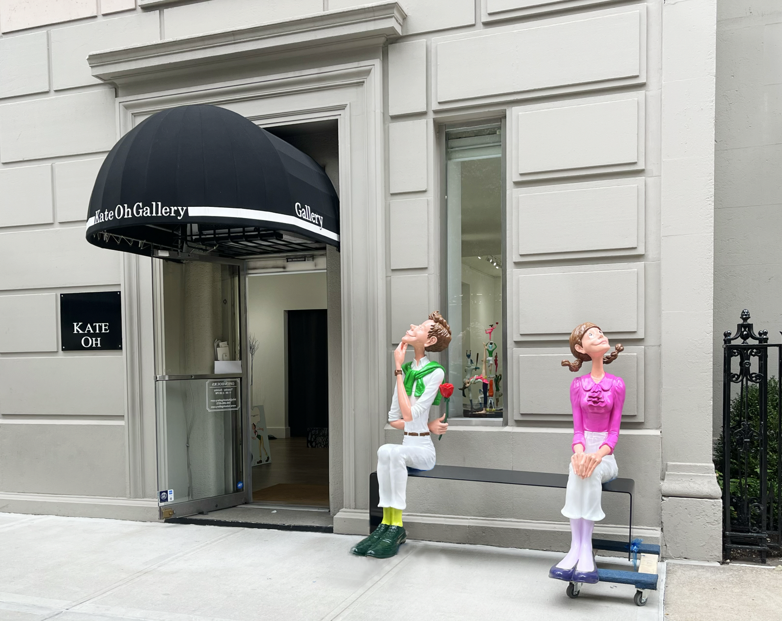
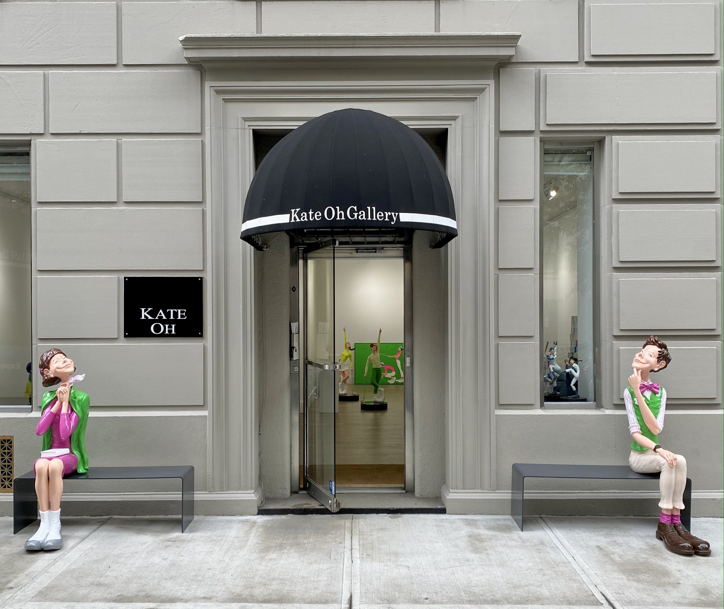
Hamptons Fine Art Fair
VIP Opening: Thursday, July 9
VIP “First-Look” Opening Preview: 12-5pm (Benefits Parrish Art Museum)
VIP Opening Preview Evening: 5-9:30pm (Benefits Southampton Arts Center)
General Admission:
Friday, July 10: 11am-7pm
Saturday, July 11: 11am-7pm
Sunday, July 12: 11am-6pm
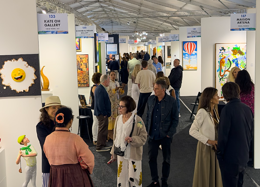
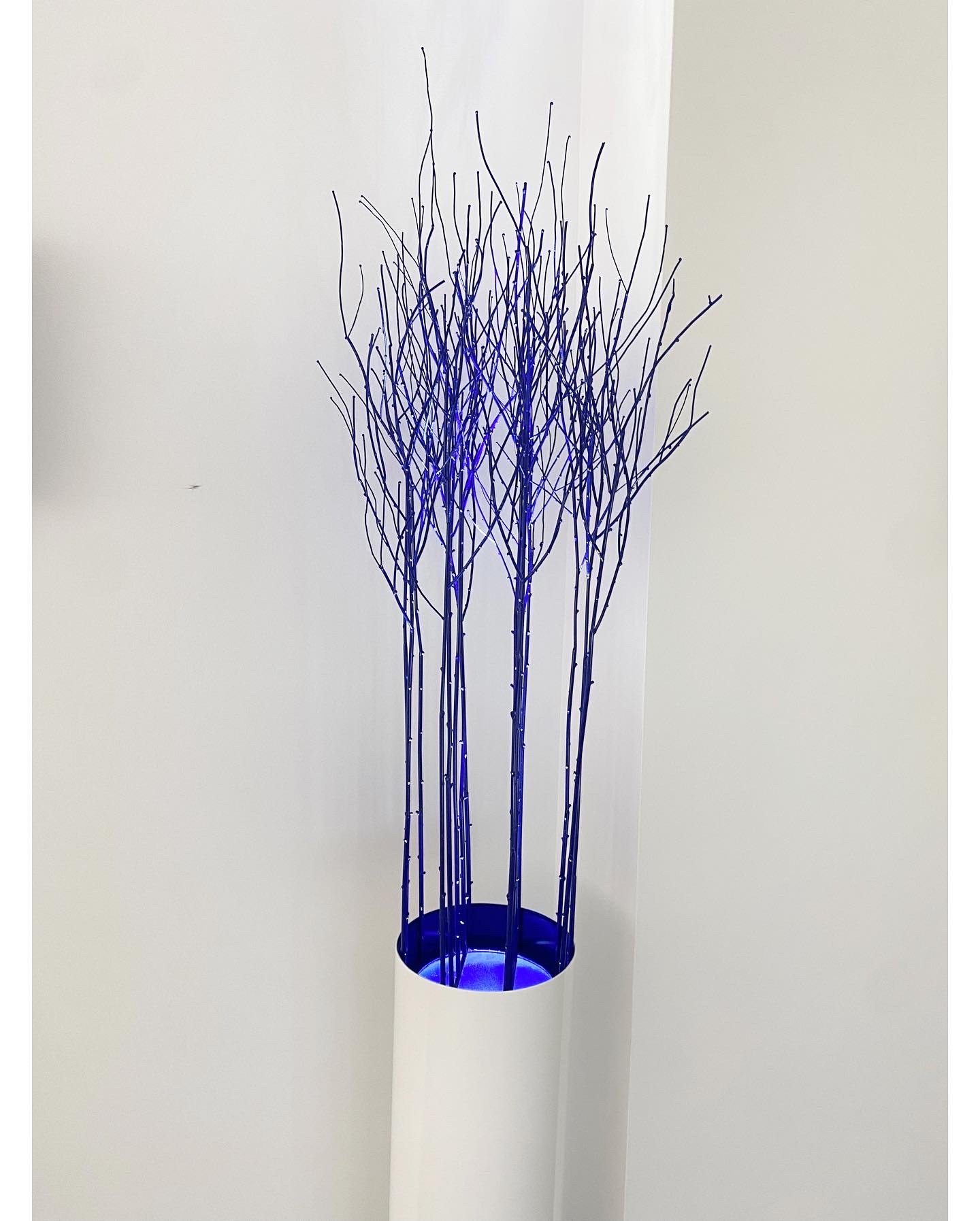
Booth #133
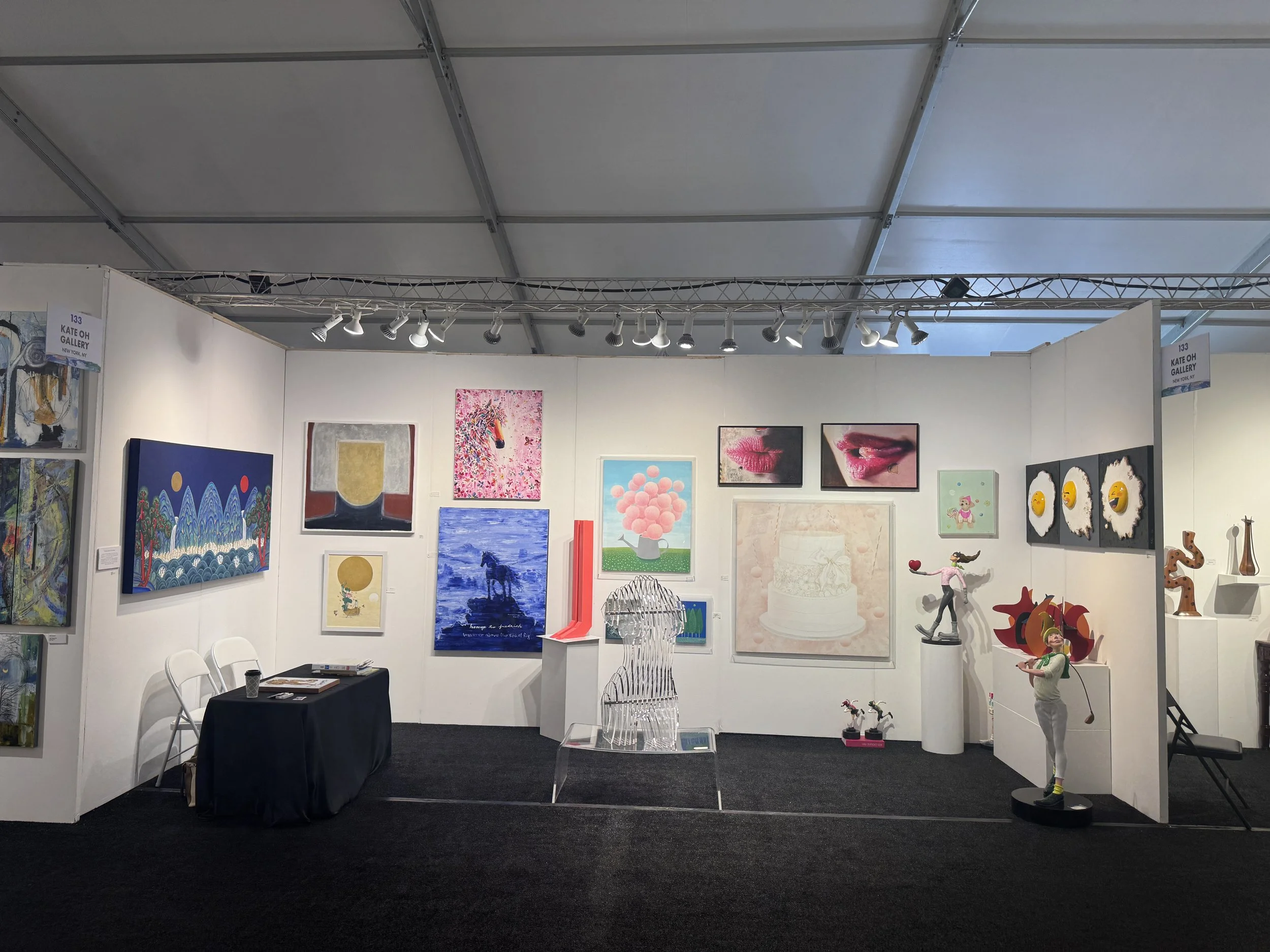
Hamptons Fine Art Fair July 9-12th. Booth #133
“US Longevity”
A dialogue between tradition, identity, and the enduring idea of longevity.
Exhibition Date: March 15-29th 2026
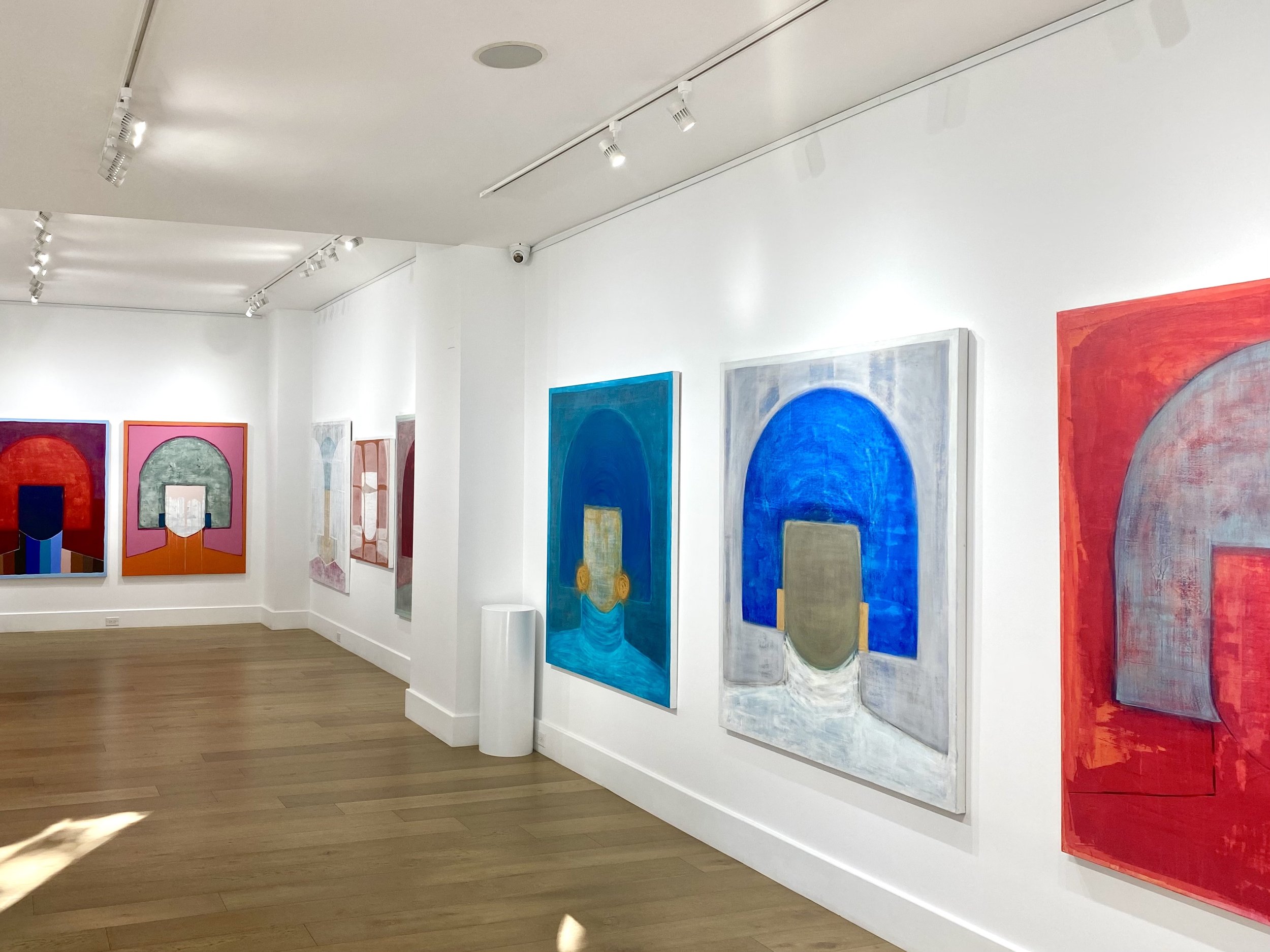
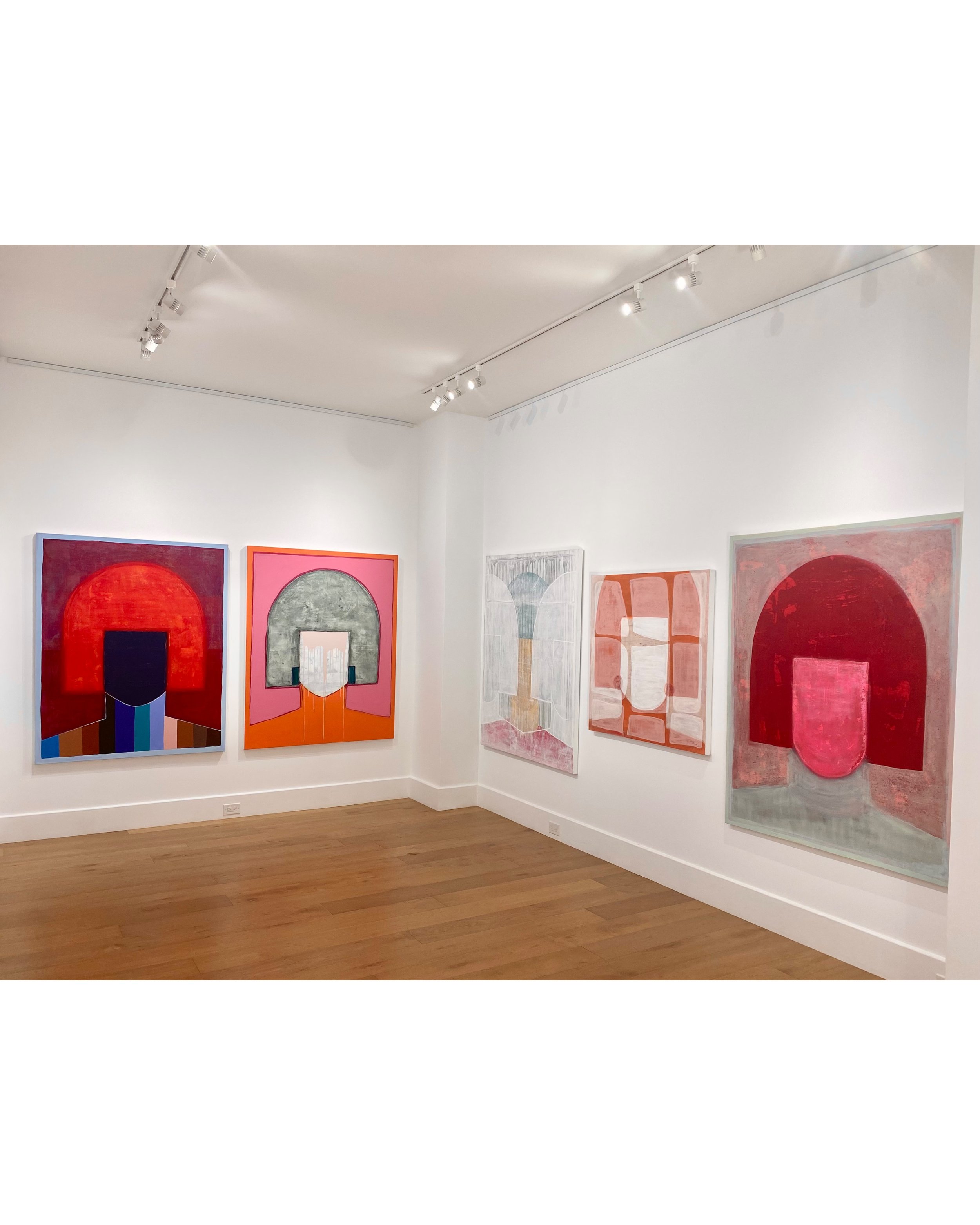
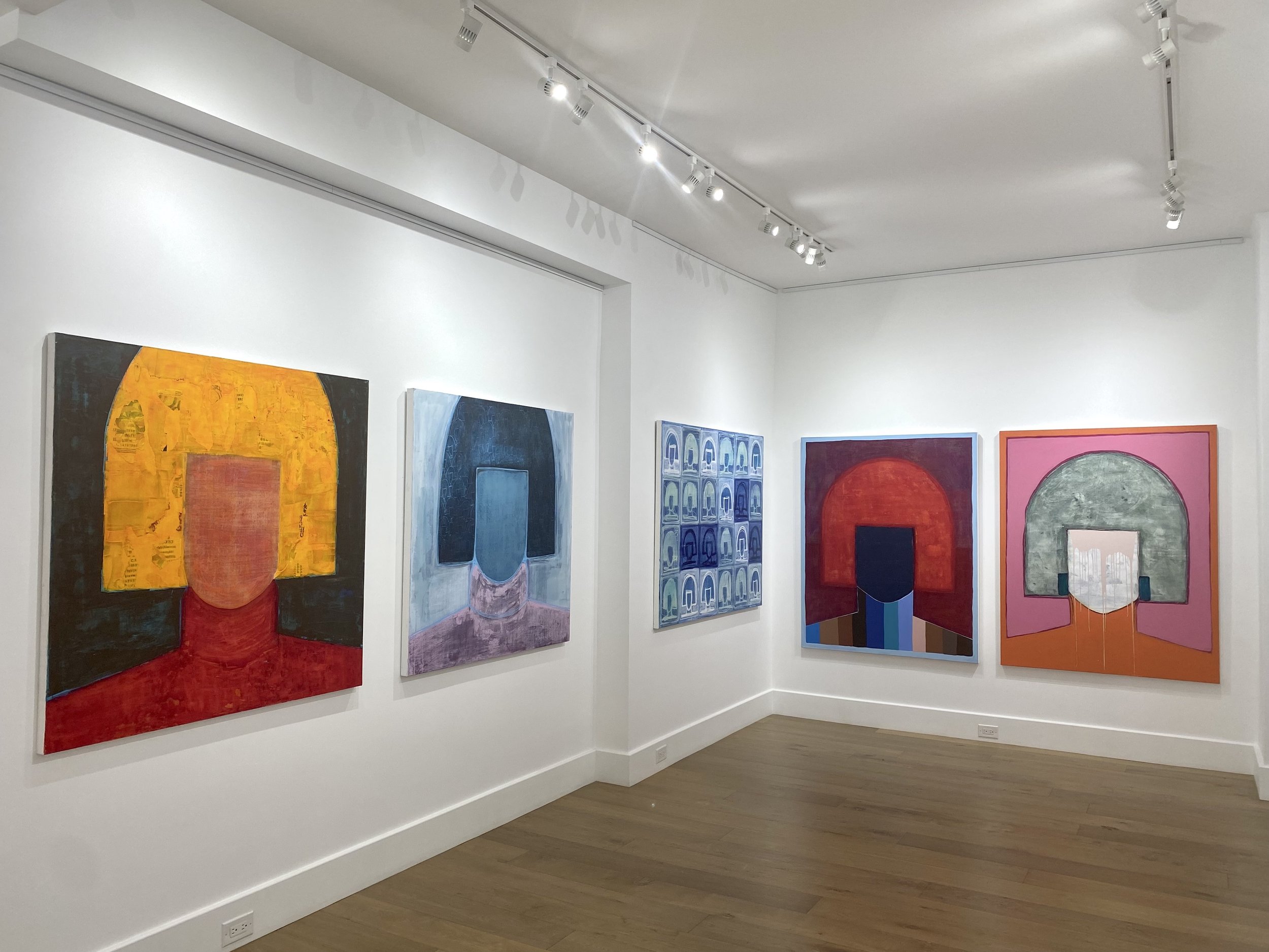
'The Sun and Moon and Five Peaks ', Kate draws directly from the irworobongdo tradition, an iconic royal screen that once stood behind the king’s throne, faithfully rendering its symbolic motifs, such as the five sacred mountains, pine trees, waterfalls, and celestial bodies that represent cosmic harmony and royal virtue. Using mineral pigments on Hanji paper, she preserves the visual flatness, bold palette, and compositional symmetry characteristic of the style, while imbuing it with her own sensitivity and restraint. Rather than modernizing or appropriating, Kate approach is one of homage, channeling the spiritual and aesthetic essence of Minhwa with remarkable care. Her work serves as a rare and moving example of how traditional art can be kept alive through faithful reinterpretation, offering viewers a timeless connection to Korea’s rich cultural and philosophical heritage.

The Sun and Moon and Five Peaks by Kate Oh, Mineral pigment on Hanji over wood panel, 72 x 36 x 2.5”
Kate Oh Gallery is pleased to present “US Longevity,” an exhibition of paintings and celadon by Lee Miyoung, Yang Ji Ae, Kim Se-Yong, Kim Ji Eun, Song Yune Kyoung, Kate Oh, Lee Jee Sun, Moon Sook Jin, Kim Kyung Ae, and Yoon Eunei
This exhibition presents works by Korean artists who reinterpret traditional ideas of longevity through contemporary perspectives. Rooted in cultural symbolism and visual heritage, the artworks reflect on endurance, balance, and the continuity of life.
Ten Symbols of Longevity refers to a group of ten auspicious elements in Korean tradition Sun, Mountain, Water, Rock, Pine tree, Clouds, Turtle, Crane, Deer, and the Mushroom of Immortality that symbolize long life, vitality, and harmony with nature. Frequently depicted in Korean paintings and decorative arts, these symbols express wishes for health, prosperity, and enduring life.
Inner Routes: Cartographies of Becoming
March 4–13, 2026
Opening Reception: Wednesday, March 4, 6:00 PM

Jean Kim Magic Boots Pink, Aluminum, powder coating 30 x 15 15
KATY PINKE
hope)is st anding st.ar
Pinke will perform a puppet show and music at the opening and closing receptions
February 10th and February 19th at 7 PM, 2026.
Exhibition Dates: February 10 - 19th, 2026
“A Utopian World Beyond Reality”
by Kim In Ok
Date: January 8th-18th, 2026

Kim In Ok’s philosophy of slowness emerges through the motif of waiting, inspired by her repeated journeys between Seoul and her studio in Hanggeum-ri, Yangpyeong. Trains and buses appear as quiet symbols of suspended time, moving gently across open plains beyond rhythmic rows of trees. Her landscapes distill nature into simplified forms, circles and triangles refined through decades of practice, transforming memory and emotion into symbolic clarity. Small houses beneath towering trees suggest imagined worlds shaped by innocence and introspection. Rather than depicting specific places, Waiting and The Road to Hanggeum-ri offer contemplative spaces of softened nostalgia, inviting viewers into moments of quiet reflection.
by S, Alexander, Ph.D., is an art historian, poet, and curator, with writings featured in Frieze New York, The Armory Show, Skira Editore, and on Jenny Holzer.
and Yoon Jin-sup
Jin Ok Ye’s ceramic vessels—ranging from molten gold–lapped pearlescent forms to charcoal-black containers adorned with gilt wings, mosaic fragments, and celadon-tinged glazes—demonstrate her exceptional mastery of form, color, and materiality, uniting sensuous surfaces, sculptural abstraction, and deeply considered palette choices into a formalist practice that animates each piece with both organic vitality and luminous visual depth.
- By Ekin Erkan, the philosopher and art history researcher whose writing has appeared in The British Journal of Aesthetics, Philosophia, and the Journal of Value Inquiry, amongst other venues. Erkan also is an art critic who contributes to the Brooklyn Rail.
“Contemplating Hanok”, New York
by Ban Gwang-Cheon
-Exhibition of Photos of National Intangible Cultural
Property Daemokjang (Master Carpenter)
-UNESCO Intangible Cultural Heritage Desination (2010)
-Cultural Heritage Repair Technician (Daemokjang).
Dates: November 25th - December 7th, 2025
“Now & Here : SUMUK
by Jimin Bae
Dates: November 4 - 9, 2025
Reception: November 6, 5-8PM
Jimin Bae’s works recall a modernist reimagining of ukiyo-e and sumuk traditions. Her use of ink and white pigment on handmade hanji paper evokes snow laden fields and luminous skies while drawing on Korean paper arts such as jong-i jogakbo, jong-i jiseung, and hanji calligraphy. Through layering and lacquering, Bae reveals the quiet pulse of hanji itself what she calls “a natural law,” explaining, “When I touch hanji, it feels like my own skin.”
In works like Nocturnal Light and Urban Echo on a Wintry Hill, architectural silhouettes and abstract ink washes merge into atmospheric tension skyscrapers dissolve into mist while charcoal threads and soft rectangles flicker between depth and surface. Bae’s process, grounded in the traditional flow of water and ink permeating paper fibers, transforms urban forms into poetic meditations on memory and place.
Through pieces such as Still Rooted, Yet Rising and The Island’s Lonely Pole, Bae continues to explore the boundaries between presence and absence, the city and the self rendering the landscape of modern life as both familiar and dreamlike.


Kate Oh Gallery is honored to present “Light, Nature, Our Lives”, a solo exhibition in Upper East side New York by artist Yeong-Hi Paik.
Paik Yeong-Hi’s canvases radiate with luminous color and poised geometry, the result of a patient gaze upon nature. At first encounter, they seem free of solemn messages; yet within their quiet harmonies, a more intimate revelation unfolds. Rectilinear peaks, clouds fractured like sculptural shards, circles traced as if to summon the sun and moon, and repeated fragments arranged in rhythmic constellations-all form a personal cosmology. Her paintings weave together threads of Korean modernism: the rigor of geometric abstraction, the radiant palette partially inherited from her teacher, the late Cheon Kyungia, and a whisper of Surrealist wonder. In this fusion, Paik offers not only a transformed vision of nature but also a subtle self-portrait, refracted through light, form, and memory. Paik’s paintings extend far beyond a formalist exercise in modernism. Trained first in East Asian traditional art and later immersed in Western modernism at the Corcoran School of Arts and Design, she infuses her work with the meditative restraint of classical landscape painting, where silence itself becomes a compositional element. Beneath luminous fields of color and crystalline geometry lies a hidden code of transcultural identity. Mountains and light central motifs for many Korean artists since the myth of Dangun and long associated with national identity and spiritual energy— are reimagined in her practice. Paik’s mountains, however, are not confined to regional landscapes; they appear almost transcendental, rising beyond geography to suggest universal ideals of harmony and peace.
by Jung-Sil Lee, Ph.D. (George Washington University)
In other works, the artist advances her observations as a geometer of life. To view the world through the lens of geometry is always a precarious project. Elementary geometry treats objects as eternal and unchanging--Platonic representations of an immortal world of forms of which our earthly paradise is merely a hollow shadow. But Paik at her best seems to propose an alternative argument. For across her compositions, even the most static shapes appear dynamic via the combination of colors like the carrier of an intangible flow. And it’s this flow, itself a geometricized rendition of worldliness, that points to something higher, namely, memory.
by Benji Alexander, Ph.D., art historian, poet, and curator, with writings featured in Frieze New York, The Armory Show, Skira Editore
Yeong-Hi Paik’s recent canvases present a minimal yet distinctive style, composed of triangular shards that evoke stained glass. These prismatic fragments, set against air and light, merge into coherent structures that reveal harmony within purposeful fragmentation.
by Ekin Erkan, Ph.D, art critic philosopher and art history researcher
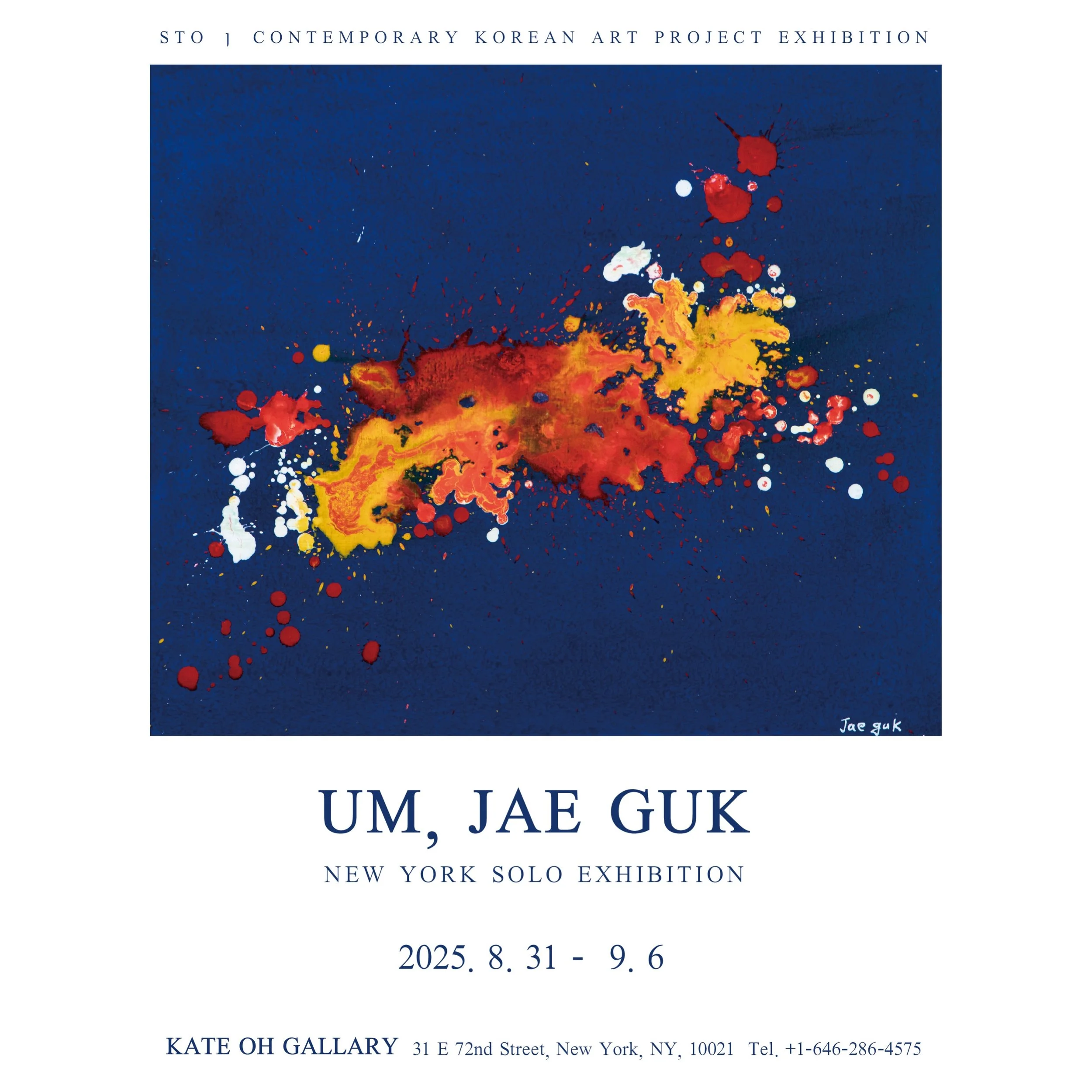

Kate Oh Gallery is pleased to present Ludens Art, a solo exhibition by acclaimed Korean conceptual artist Um, Jae-guk, on view from August 31 to Sep-tember 6, 2025, in New York.Um’s practice dismantles and reimagines the essence of art through the lens of “play,” merging painting, sculpture, and performance into a dynamic, partici-patory experience.
Exhibition Dates: August 24 - 30, 2025
Opening reception : August 24, at 3-5Pm

“Echoes of Light”
Dates: August 7- 22, 2025
Anay Nagawang Chodak, Angels Grau, Changha Hwang, Chi Gyu Kwon, Gyongmin Kim, Kate Oh, Kristine Virsis, Kwangsik Jung, Kwan Jin Oh, Laetitia Guyon, Sia Sangbok Lee, Rainy Tang, Sunhee Yang, Stephanie Kim

by Angels Grau
The First Encounter by Kim Gyoung Min
63 x 39.3 x 57.5 in, Acrylic on bronze, stainless steel. 2023
“Hello My Name Is”
By Changha Hwang
Exhibition Dates: July 24th-August 2nd (August 3rd-7th appointment only)
Opening Reception: July 24th, 5 - 8 PM

New York-based artist Changha Hwang's recent paintings are rich with pixelated, geometric patterns that reflect a distinctly digital aesthetic. While his earlier work featured skeletal lattices, his newer pieces present layered, filled-in forms that evoke digital networks and visual noise. Art critic Pierre Sterckx observes that Hwang’s work appears to emerge from computer manipulation and mirrors the technological environments we now inhabit.
These paintings metaphorically explore how digital life shapes perception and behavior, shifting from a once-liberating, anonymous internet to a domain increasingly defined by surveillance and control. Through visually dense, partially obscured compositions, Hwang captures the complexity of digital existence, networked identity, and the tension between visibility and opacity in the age of Big Data.
by Ekin Erkan
Ekin Erkan is a philosopher and art history researcher whose writing has appeared in The British Journal of Aesthetics, Philosophia, and the Journal of Value Inquiry, amongst other venues. Erkan also is an art critic who contributes to the Brooklyn Rail.

Winsor Birchltd are delighted to announce a landmark exhibition of
Henry Orlik’s American paintings and drawings at the Kate Oh Gallery
Dates: June 17 to 29, 2025

THE NEW YORKER
One afternoon in February of 2024, Grant Ford, an art adviser and dealer in the English town of Marlborough, received a phone call from a local lawyer named David J. Goldsmith. Goldsmith wanted advice about a case involving an elderly painter, who had been evicted from his apartment in London. The painter, Henry Orlik, claimed to have lost hundreds of paintings during the eviction, which had taken place while he was in the hospital, recovering from a stroke. Orlik, who was seventy-seven, was in poor health and desperate to get his pictures back. Goldsmith needed to know what the paintings might be worth.
Goldsmith’s office, on Marlborough’s high street, is around the corner from Ford’s gallery. For thirty years, until 2016, Ford had worked for Sotheby’s, the auction house, as an auctioneer and a specialist in British and Irish art, before setting up his own business. He also appears on the BBC’s “Antiques Roadshow.” “By that stage, you kind of think you know it all,” Ford told me. He headed over to Goldsmith’s office, where Jan Pietruszka, a friend of Orlik’s family, had brought around ten pictures. The canvases were propped up on filing cabinets and leaning against a wall.
Ford was struck immediately by the paintings’ eerie intensity and control. “I was thinking, Why haven’t I heard of this artist?” Ford said. The work seemed to belong to Britain’s mid-twentieth-century movement of Surrealist art, which included painters such as John Armstrong, Conroy Maddox, and Ithell Colquhoun. But Ford was drawn to Orlik’s obsessive method: layer upon layer of different-colored hairlike brushstrokes, in acrylic, which together created a sense of dizzying detail. “I was thinking, Well, these are quite like John Armstrong, but actually they’re better than John Armstrong,” Ford said. “He’s actually much, much better than all of that.” One Orlik canvas, called “Don’t Vote,” from 1974, suggested a desolate stage at a political rally, complete with balloons, loudspeakers, and flags, under a sky of golden halo-shaped clouds. The scene rests on a heap of strange, luscious plants.
Anay Ngawang Chodak E-Catalog:
https://heyzine.com/flip-book/f61e68df80.html

Modern Reflections of Wisdom and Compassion
by Anay Ngawang Chodak
Kate Oh Gallery presents "Modern Reflections of Wisdom and Compassion," a solo exhibition by Anay Ngawang Chodak, a contemporary artist who bridges centuries of Tibetan Buddhist tradition with the visual language of contemporary abstraction. Rooted in the refined techniques of traditional Buddhist art, Anay’s work explores the spiritual dimensions of form, color, and human inner values through motifs—his signature Happiness Pods, interconnected patterns, blossoming floral elements, and luminous color fields.
Delivering his art through contemporary visual expression, Anay creates a meaningful connection between ancient wisdom and modern life, allowing today’s audiences to engage with universal Buddhist values through a fresh, contemporary lens. This exhibition invites viewers into a vibrant, visually exquisite, meditative space where Anay Ngawang Chodak’s meditative art serves as a mirror for inner clarity, interconnectedness, and oneness.
Anay Ngawang Chodak’s work emerges as a sincere expression of inner insight, where meditation and philosophy converge in visual form, continuing to unfold and evolve within contemporary art spaces. Anay forges a meaningful connection between ancient wisdom and modern life through a contemporary visual language, offering audiences a fresh and deeply resonant means to engage with universal Buddhist values. This exhibition invites viewers into a vibrant, visually exquisite, and meditative space where Anay Ngawang Chodak’s art serves as a mirror for inner clarity, interconnectedness, and oneness.
In conjunction with the exhibition, the artist will also lead a special Meditative Art Class consisting of three immersive sessions. June 8,9 and 15th at the Kate oh gallery.
Rooted in traditional techniques and mindfulness practices, these guided workshops provide participants with an opportunity to explore the calming and introspective nature of art-making under Anay’s instruction. Advance registration is required, and a participation fee applies.

Born in 1968 in Tbilisi, Georgia, Rusudan Petviashvili’s artistry has been celebrated worldwide. Listed in “2000 Famous Persons of the 20th Century” by the Cambridge Biographical Center, Rusudan’s talent emerged early in life — her first solo exhibition took place at the remarkable age of six. Rusudan’s artworks have graced various exhibitions in notable cities such as Paris, London, Berlin, Geneva, Vienna, and Budapest. Her illustrations have also been featured in esteemed publications, including the “National Fairy Tales of Georgia” and the celebrated French edition of “The Knight in the Panther’s Skin".” Furthermore, Rusudan illustrated an exclusive handwritten New Testament with the blessing of the Georgian Patriarch, now displayed as part of the world’s largest handwritten Gospel at the Cathedral of the Holy Trinity in Tbilisi. Her works are part of private collections worldwide.
Touchable Sky
Presented by KOREANECTION
In collaboration with Buan Celadon Museum
Exhibition Dates: May 18–28, 2025

The celadon works presented in this exhibition were produced at the Buan Official Kiln in South Korea, a state-operated ceramics center during the Goryeo Dynasty. As a government-run kiln, Buan was responsible for creating high-quality wares for royal and official use, showcasing the height of celadon artistry through its refined inlay techniques and elegant jade-green glaze.
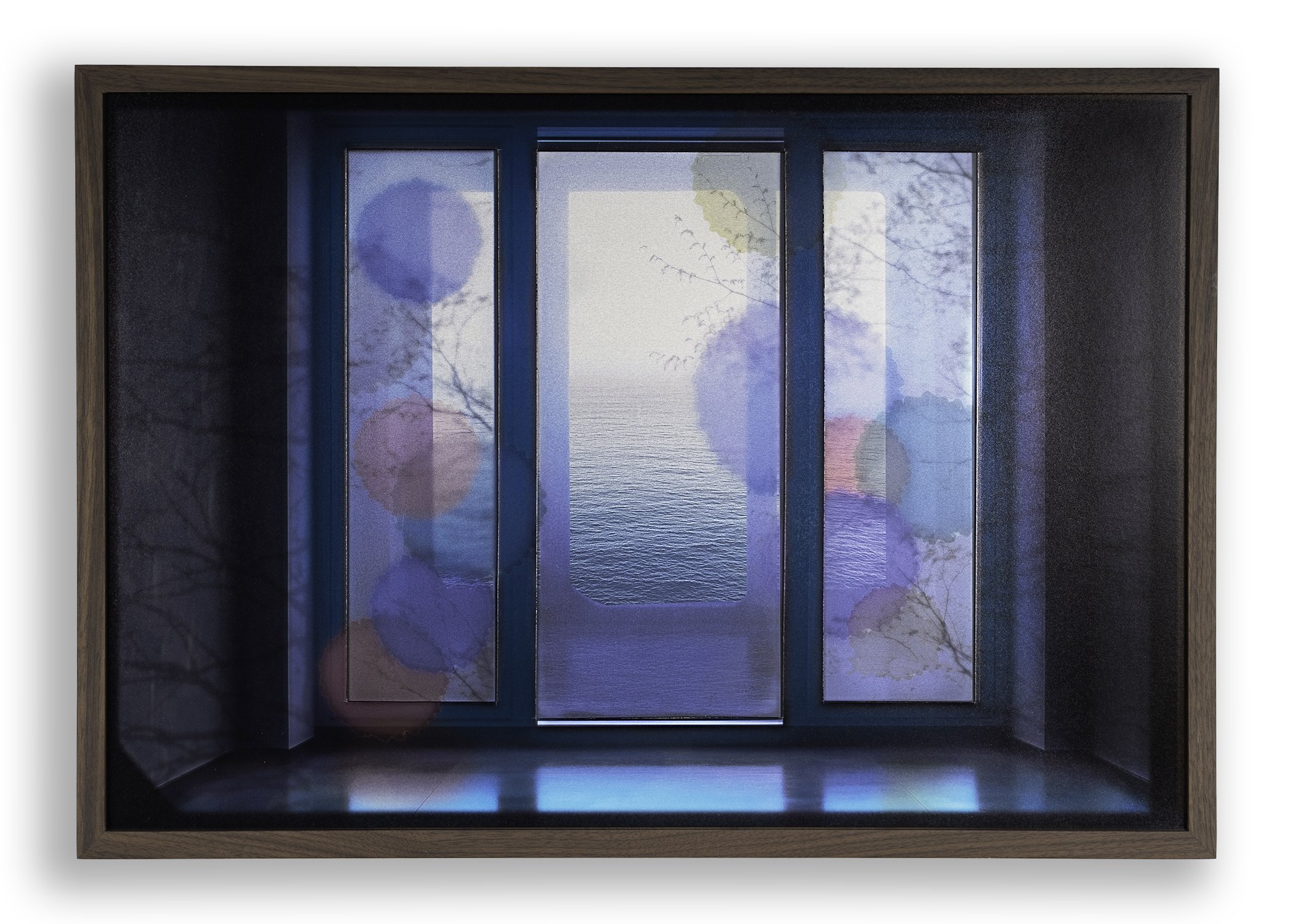
“Selective Memory” by Nevil Dwek
Kate Oh Gallery is proud to present Selective Memory, a solo exhibition by multidisciplinary New York artist Nevil Dwek, on view from May 1–17, 2025
Dwek will also host an author reading with Michelle Young for her newest book The Art Spy: The Extraordinary Untold Tale of WWII Resistance Hero Rose Valland on May 8th from 6pm – 8pm.
On May 17th, the gallery will participate in the Madison Avenue Spring Gallery Walk, where Dwek will hold an artist talk at 1pm, 2pm and 3pm.

A graduate of NYU’s Tisch School of the Arts, Dwek’s art has been exhibited internationally, including shows with The Core Club, Shrine Gallery, Artopia Consulting and Red Fox Gallery. As a professional photographer, Dwek was commissioned for bespoke projects with clients including Peter Marino, Chanel and Ralph Lauren. He also founded Dmr Productions, a film and photography company whose work has earned multiple awards
In Selective Memory, Dwek invites viewers to explore the space where memory and presence converge, where the light of now reflects the shadows of then. He uses windows as both literal and metaphorical portals, as each piece invites a return to memory through light and perception. Reflections, shifting shadows, and subtle color are more than visual elements, holding a romantic nostalgia shaped by moments that once felt more alive, more connected. What we remember depends on where we are now.
Using his personal photography archive, Dwek builds dimensional, collage-like works crafted using materials such as aluminum, mirrors, and plexiglass to create that layered, shifting world. He uses photo paper and clear film, cutting it by hand and layering it to build dimensionality and includes his writing in the pieces as well as AI tools when needed to expand and support the emotional and conceptual depth of the work. To evoke the dreamlike, shifting quality that memories often hold, Dwek adds alcohol inks andIndian inks to introduce fluid and unpredictable color in the work.
“The past in this series is not static. It flickers, fades, glows again. And through reflective materials, we glimpse how the past and present coexist, as the light and reflections stir a quiet tension between presence and memory,” said Dwek. “These reflections are not fixed. They evolve.” On May 17th, the gallery will participate in the Madison Avenue Spring Gallery Walk, where Dwek will hold an artist talk at 1pm, 2pm and 3pm.

“Wings of Joy” Exhibition Dates: April 3-18th, 2025

Pema Rinzin


Asian Art week

The Luminous Heart: Sun Hee Yang’s Multicultural Vision of Color, Pop, and Transcendence
In a city where Western art often dominates, the Kate Oh Gallery offers a fresh platform for Korean contemporary art, blending history, modernity, and spiritual depth. Sun Hee Yang’s work embodies this synthesis, merging Buddhist.


A Vessel Embracing the Universe


Sia Sang Bok Lee’s work explores organic yet abstract elements, characterized by textures and spatial dynamics centered on the interplay of light and shadow. Her creations evoke both cosmic and microscopic realms, devoid of human or animal figures, yet rich in organic forms and movements.
Often utilizing hanji paper and canvas as her base, Lee enhances visual tactility and depth, delving into the subjective quality of light. This approach resonates with Mark Rothko’s concept of "light impressionism," emphasizing light’s ability to unify space and create atmospheric tactility. Lee employs this principle to construct organic worlds where light and darkness coexist in harmonious juxtaposition.
Her works refrain from depicting literal or representational scenes, instead offering abstract, cosmic imagery that invites the viewer's interpretation. Through series such as "Cosmos" and "Relationship of Life," Lee has consistently explored organicity—creating de-peopled landscapes and abstract environments that suggest cellular or planetary phenomena.
In her recent works, Lee delves further into celestial abstraction, incorporating elements of stars and the cosmos to build worlds that transcend traditional earthly motifs. Her art masterfully balances illumination and shadow, crafting a poetic, meditative practice that highlights ripples, textures, and the quiet interplay of light. Her works, grounded in meticulous technique and thoughtful composition, invite viewers to pause and reflect, engaging deeply with the organic and the sublime.

Vibrant Perspectives: The Art of Marko Stout
Marko Stout’s newest and most exciting exhibition is launching on December 5th at the iconic Kate Oh Gallery on the Upper East Side. Expect bold colors, edgy themes, and the raw energy of urban life brought to life in Stout’s unforgettable style. Join us for an evening of art, creativity, and great company as we celebrate this highly anticipated show!
“Marko Stout is a rockstar in the art world” - RollingStone Magazine
“Marko Stout is the epitome of glamour” -
COSMOPOLITAN Magazine
Opening Night: December 5, 2024


INVITATION
Collect Brazilian Jewelry, curated by Dorine Botana, is honored to invite you to the new edition of its highly anticipated exhibition of signature jewelry, showcasing the creative talent of renowned Brazilian artists.

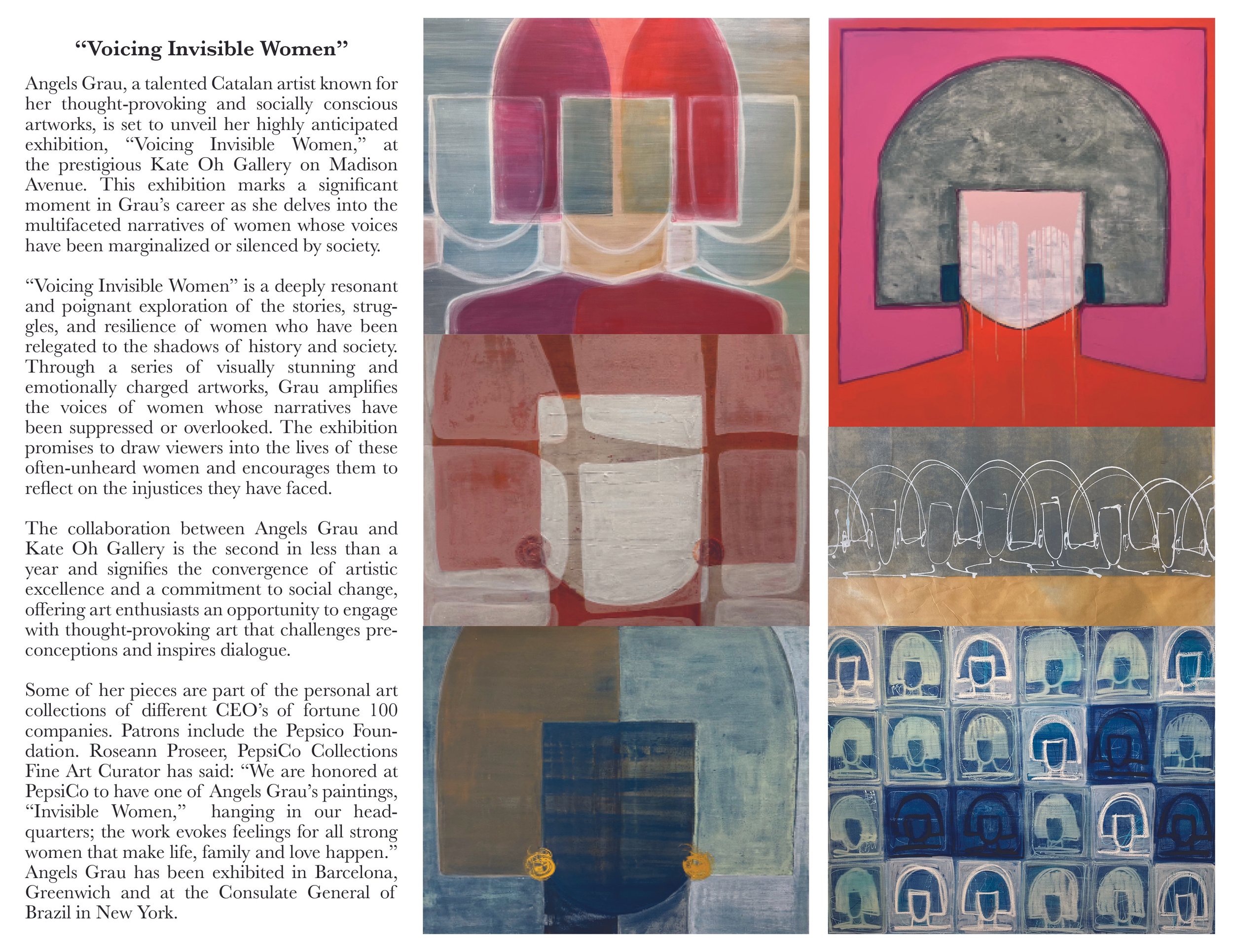
“ Invisible Women & Brave Girls” by Angels Grau
October 10 - November 3rd, 2024


Angels Grau Invisible Women 48x48”

Invisible Women & Brave Girls by Angles Grau
Kate Oh Gallery is delighted to present “Invisible Women & Brave Girls”, an exhibition of acrylic paintings by Àngels Grau, a Spanish artist renowned for her powerful portrayal of both physical and metaphorical strength. Inspired by her daughters, Claudia and Mafalda, this series goes beyond traditional art, offering a bold visual statement that encourages every girl to confront challenges, harness her inner strength, and transform the world.
“Brave Girls” embodies the fearless spirit of the girl who confronted the Wall Street bull, standing as a symbol of courage and resilience. These works capture the ability to rise, lift oneself up, and start again, even when everything around seems to be crumbling.
The series portrays young women who, despite being overlooked or undervalued, face life’s obstacles with heads held high and unwavering confidence. Like the girl who defied the bull of tradition and expectation, each “Brave Girl” represents the power to break down barriers, challenge societal norms, and embrace limitless possibilities. These women are not merely surviving—they are thriving and leading change.
In each painting, Grau vividly depicts the strength, passion, and talent of these young women. Her work conveys both individual stories and the collective spirit of women pushing boundaries and striving for a better world.
At the heart of this series is the message: You Can. Each painting resonates with the belief that great achievements are possible when challenges are faced with courage. “Brave Girls” is not just an art series—it’s a movement for change, inspiring young women to stand up, break barriers, and create their own futures.
“ Wanderer” by Kim Seok-Young
Dates: Oct 1-8th, 2024

“Wanderer” by Kim Seok-Young from October 1-8th, 2024
Kate Oh Gallery is thrilled to present "Wanderer" by Kim Seok-Young, the artist's 33rd solo exhibition.
Opening October 1st in New York, this show introduces Kim Seok-Young, an artist renowned for his powerful expressionist works featuring horses, flowers, and human figures. Kim's diverse practice spans painting, video, and sculpture, blending Eastern spiritual energy with contemporary artistic expressions. For his New York debut in the heart of the contemporary art world, Kim has chosen the theme "Discovery" - a journey to find oneself and our collective identity.
As Robert Morgan writes in the exhibition foreword:
"Viewers will feel a surge of 'qi' (life force) emanating from Kim's works. The artist's boundless energy release connects to the Taoist concept of 'Dao' or 'Way' - essentially a path to enlightenment. There's no set formula for this process. It's like sweeping fallen leaves on quiet temple steps - a means for something to unfold. This exhibition invites us to embark on a journey of self-discovery, asking: 'Who are we, and what are our potentials?'"
In these turbulent times of global environmental crises and conflicts, this exhibition offers a moment to reflect on and rediscover ourselves and our shared humanity.
“ Impermanent Bubbles” by Pema Rinzin
Dates: Sep 5th - 29th, 2024


Kate Oh Gallery is pleased to announce Impermanent Bubbles, the first solo show of Pema Rinzin at the gallery.
Bubbles painted with natural dyes and hand-ground mineral pigments fill up Rinzin’s canvases, wood panels, and paper works. The foamy fields are at once planar and dimensional: micro and macro; claustrophobic swarms and vast expanses.
Rinzin chose the bubble because it cannot be held. It appears shimmering before you for only a moment before it pops. Rinzin understands the main teaching of Tibetan Buddhism to be impermanence. For him, there is much to be learned from contemplating something so small and transient.
The bubble is not a new shape for Rinzin. In fact, he has been encircling color since he trained to become a master in Tibetan thangka painting. In every Tibetan thangka, there is an offering presented which represents a gem. Either yellow, blue, green, or red, it is a physical offering to the gods. But its abstract rendering reminds us that even if you have nothing material to give, there is always something to offer: a water droplet, an idea, a prayer.
Rinzin’s past bodies of work have been more figurative. For Impermanent Bubble, he was looking for a process of repetition that paralleled the chanting of a Mantra. “You don’t wear out a mantra,” says Rinzin. “You can do a mantra through all your life into your next life. Collecting one million; two million; three million.” He admits boredom can creep in during the time-consuming repetition of the painting process. But this, too, is an important part of the practice. Cycling through becoming numb, he will once again emerge into the awareness and the sweetness of his efforts.
As Rinzin developed these paintings, he noticed that the bubbles took on particular characteristics. For instance, certain color combinations caused fields of bubbles to form landscapes. Others suggested the cosmos. Still others, which he calls dropping bubbles, became worlds within world, nested and playing with scale.
“Insight and Sapience” by Erica Kim
August 13th- September 3rd, 2024
Erica Kim’s art featured at Times Square on a Billboard on August 23rd, 2024

Summer Group Exhibition
July 23- Aug 11th

Lana (Sveta) Malakhoff
Dates: July 2 - 20, 2024


Urban Wave - New York
Dates: June 4 -11, 2024


Agnes Son Exhibition
Dates: May 22 - June 2, 2024

Artist Statement
I pursue perfection again today, striving to achieve it with all my might. Yet, I despair as I feel the emptiness of unfulfilled yearning. Is realizing that nothing is perfect the destination of life? What is the standard of perfection?
Today, I torment myself in the pursuit of perfection once more. Let it go. It must be let go. Dot by dot. These form lines. Lines, lines, they reveal surfaces.
Today, hardship and happiness coexist. Perhaps everything is completed when they coexist, where even aging and novelty add depth to the canvas of life.
Is perfection the coexistence of completeness and incompleteness? Today, I meet the me of 40 years ago and face the present me. The weight cannot be measured, but all the emotions that were by my side then led the present me into anger, despair, and regret. In the end, reconciling with all those emotions, I shape the present me, leading me to tomorrow with excitement. Joyful and happy, every moment spent with my art.
Dot, Line, and Surface.

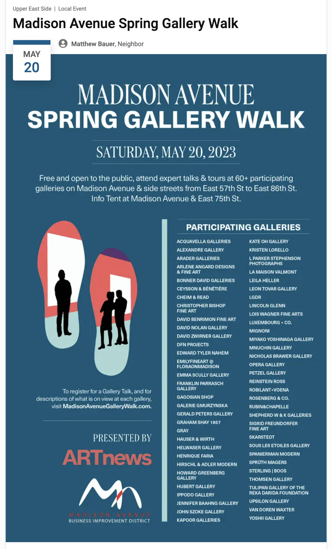
On May 18th, Kate Oh Gallery by Asher Min’s photography exhibition will be part of the “Madison Avenue Spring Gallery Walk 2024” and there will be two Gallery Talks at 2:00pm, and 4:00pm. It is FREE and OPEN TO THE PUBLIC.
Asher Min
May 8-19th, 2024

“Min’s photographs catch us in the dark, which is how he wants them to be. As expressed in “Waterfall of My Dreams”, there are three elements that constitute the subject matter in this work. They include “painting, performance, and photography.” Together, the viewer is invited to concentrate on this work as if the evening waterfalls were actually going to descend, which finally they will, prior to being caught in abstract shapes between the various limits of light that surround their depth and darkness.”
- Robert C. Morgan, art critic

Laura Manuel
Date: April 16-28, 2024


“ About Hope” Hanji, oriental paint, 56.5 x 82.5” $50,000
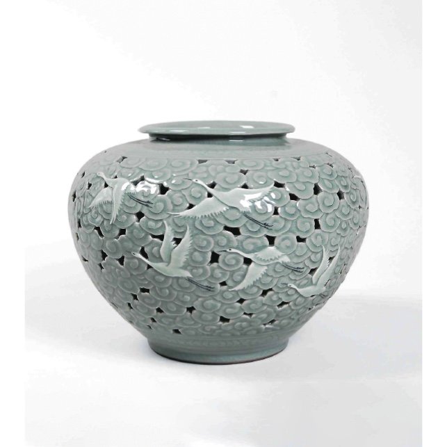
“Royal Celadons”
Exhibition Date: January 6 - March 14, 2024
By appointment only from February 9 - March 14
RSVP at info@kateohgallery.com or (646) 286-4575
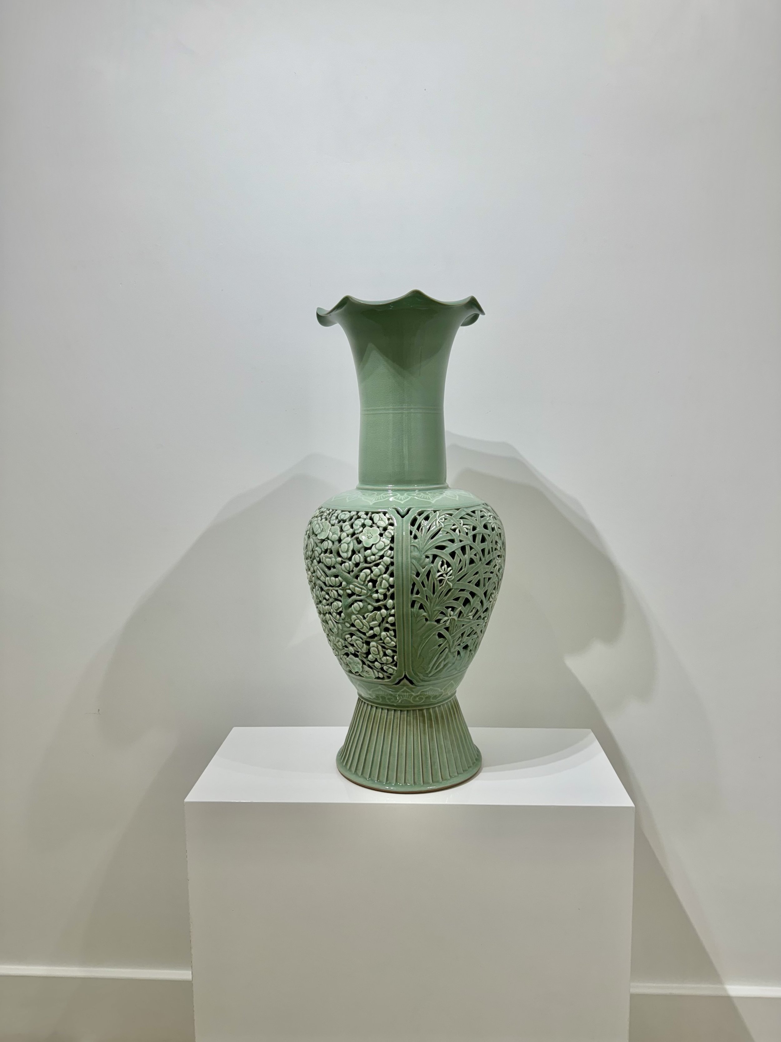
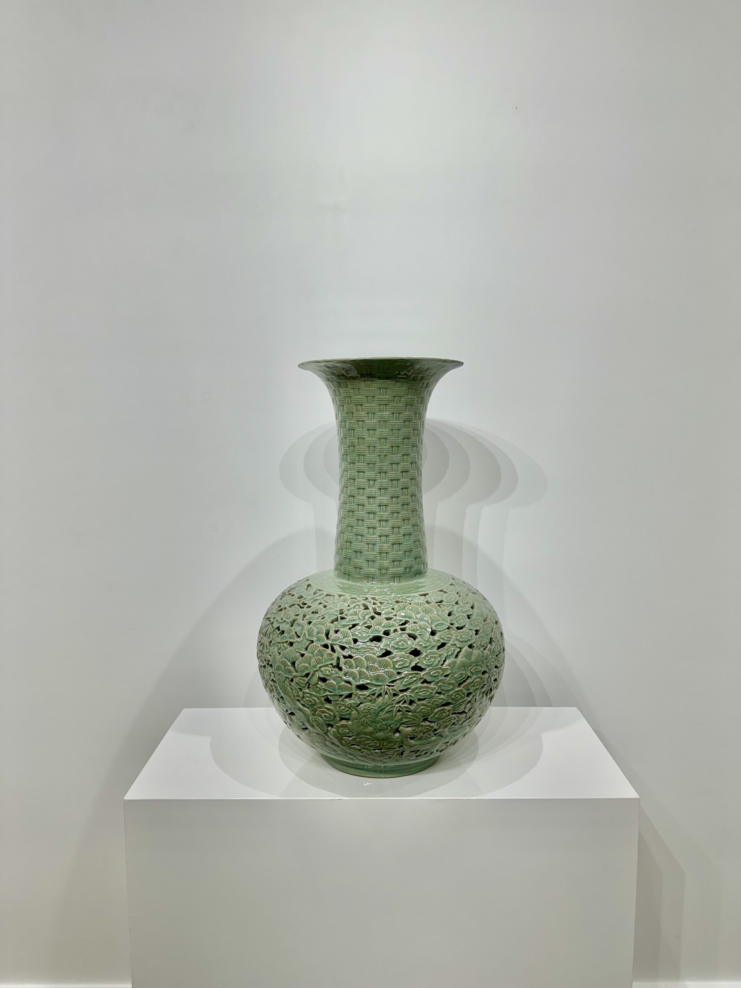
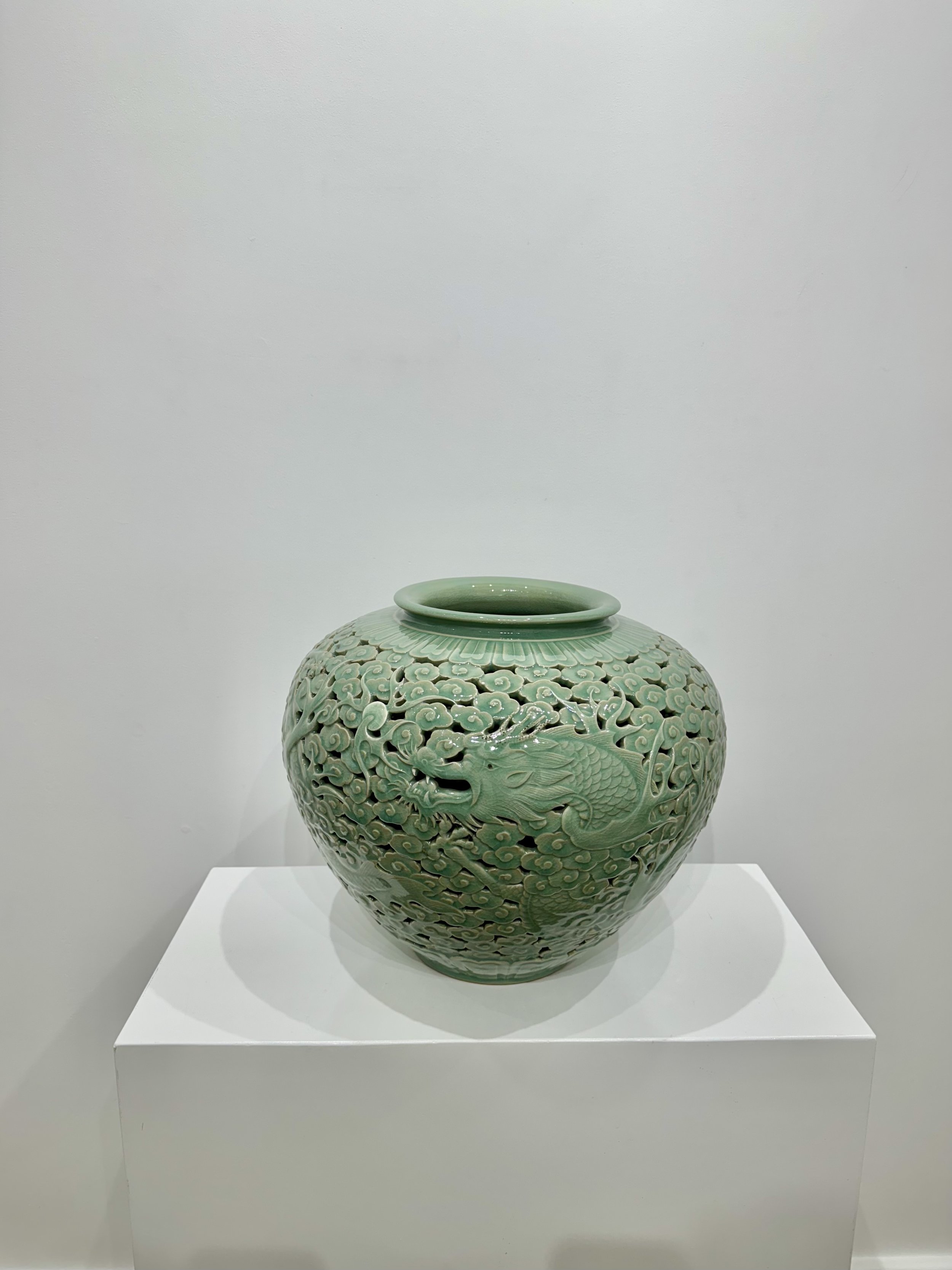
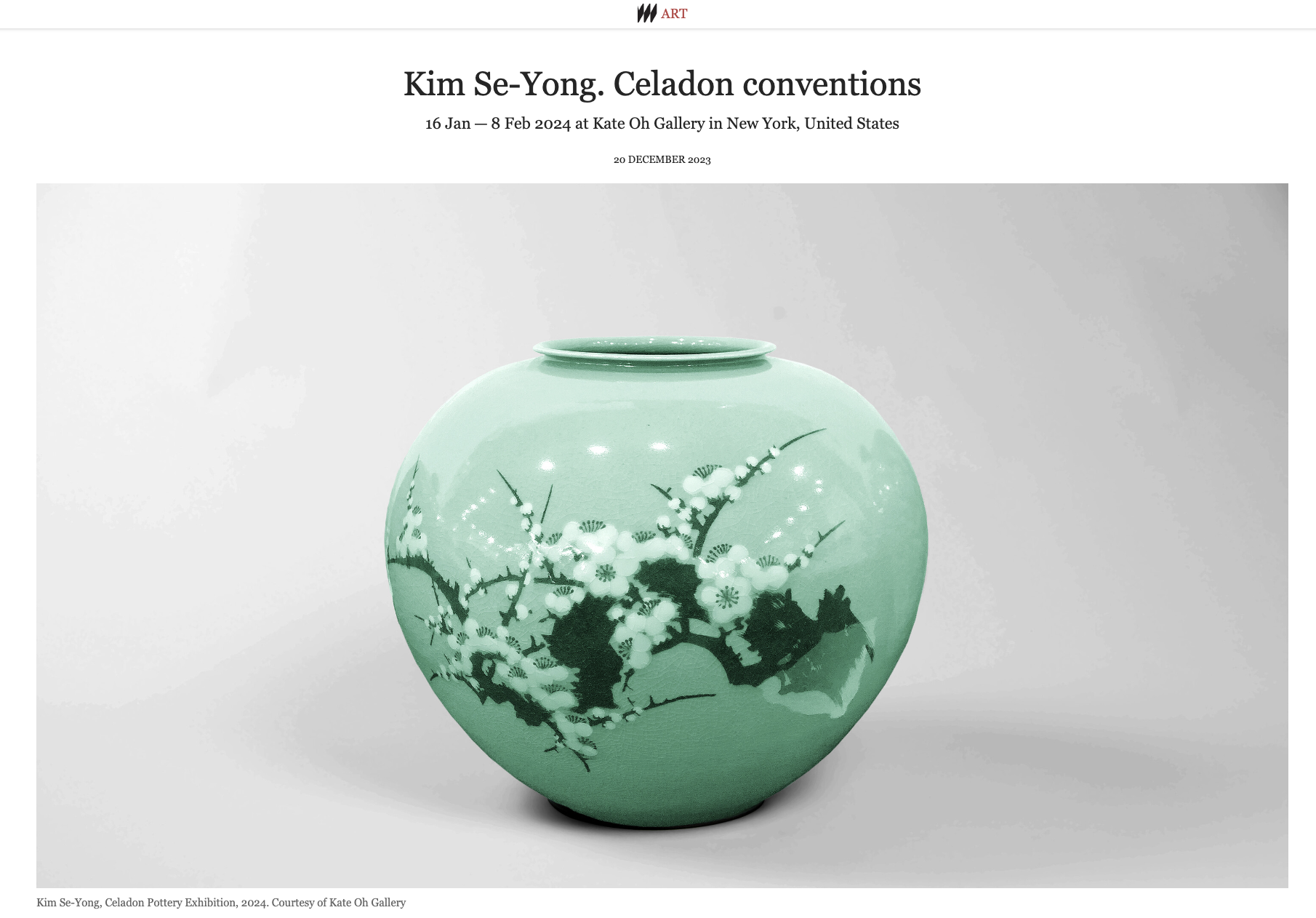
https://www.meer.com/en/77588-kim-se-yong-celadon-conventions
Kate Oh Gallery - video credit to creativeAgroup
HeizleLand
December 19, 2023 - January 5, 2024

“Symphony of Opulence”
by Marko Stout

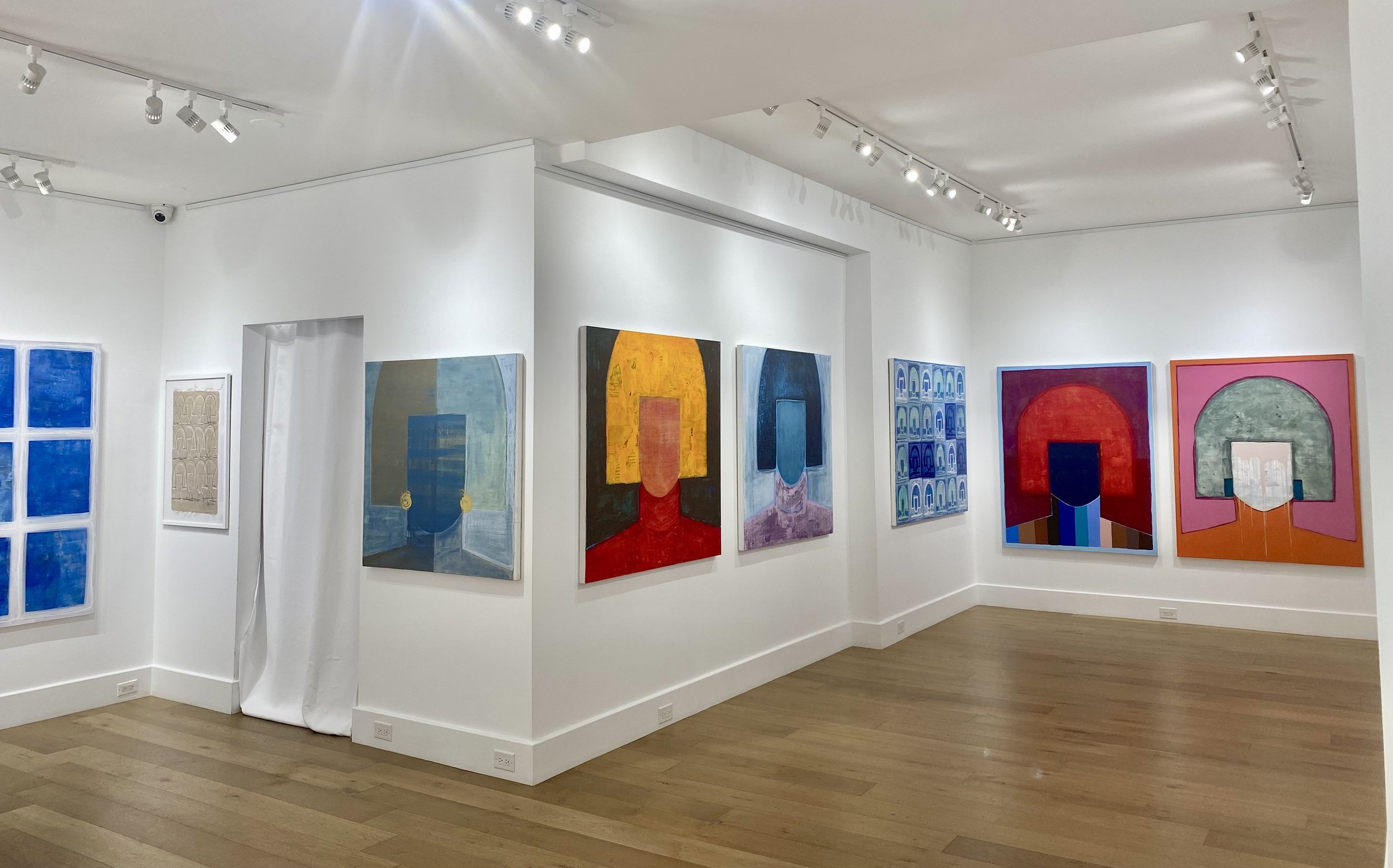
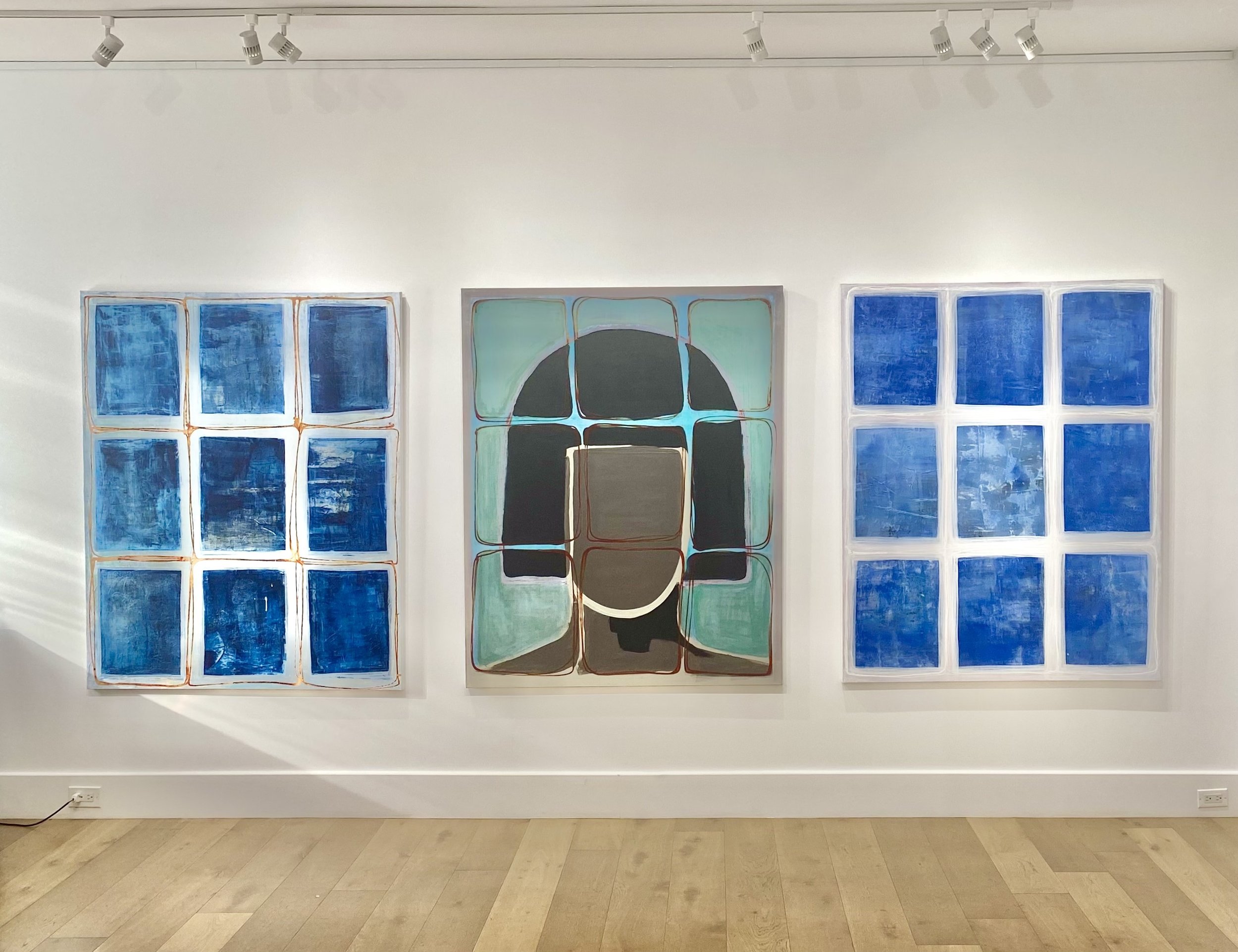
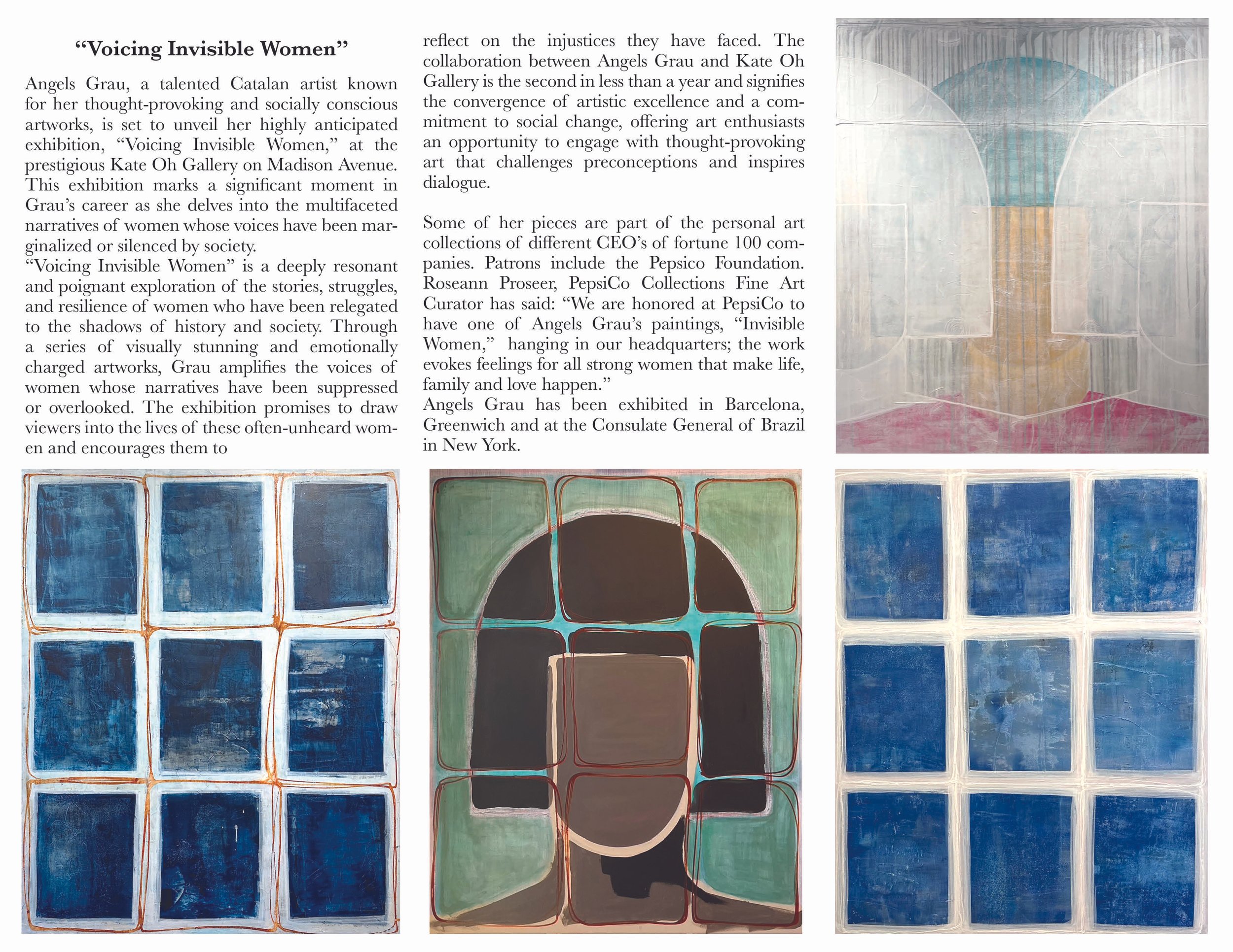
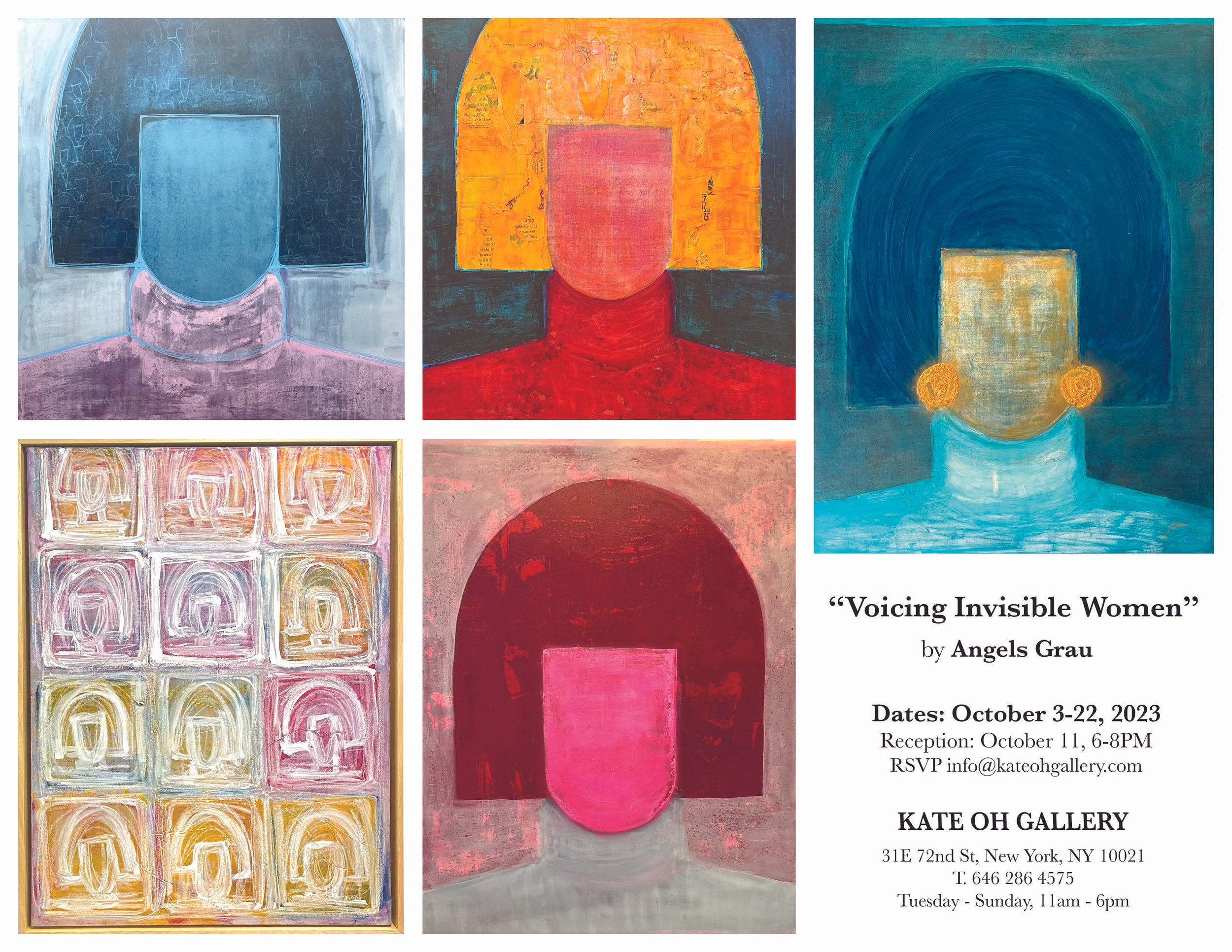
”Voicing Invisible Women”
by Angels Grau
October 3 - 22, 2023
“The Lyricism of Organic Tradition”
by Kim Gyoungmin
August 24 - September 30, 2023
![프로처럼. [man]14x14x35(h)cm. [woman] 14x14x34(h)cm. acyrlic on rboze, marble. 2022. 각 120만원 (5).jpg](https://images.squarespace-cdn.com/content/v1/59404fd8e3df288fc6563337/1691783391101-FMBW6AFHKBBV9G07E0QM/%E1%84%91%E1%85%B3%E1%84%85%E1%85%A9%E1%84%8E%E1%85%A5%E1%84%85%E1%85%A5%E1%86%B7.+%5Bman%5D14x14x35%28h%29cm.+%5Bwoman%5D+14x14x34%28h%29cm.+acyrlic+on+rboze%2C+marble.+2022.+%E1%84%80%E1%85%A1%E1%86%A8+120%E1%84%86%E1%85%A1%E1%86%AB%E1%84%8B%E1%85%AF%E1%86%AB+%285%29.jpg)

“The Lyricism of Organic Tradition”
by Kwon Chigyu
August 24 - September 30, 2023
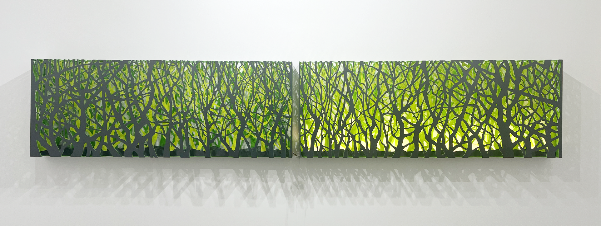

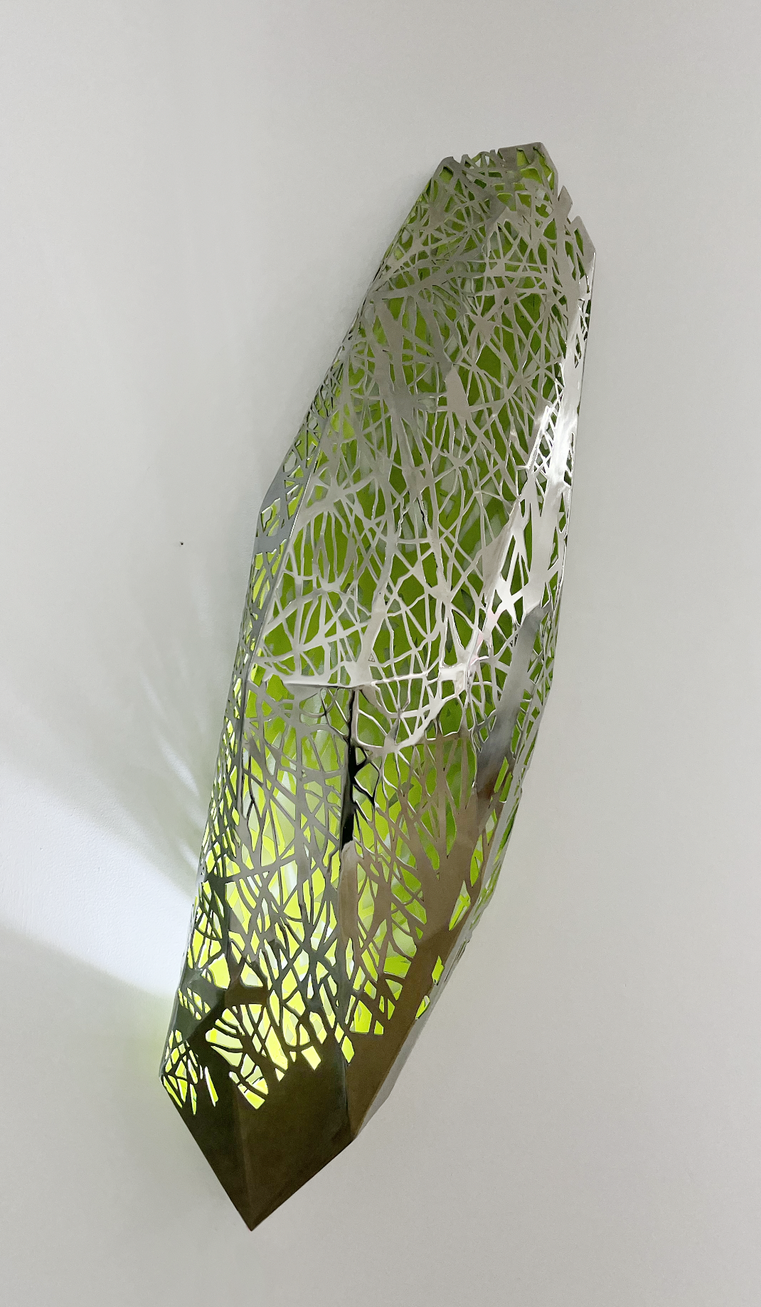
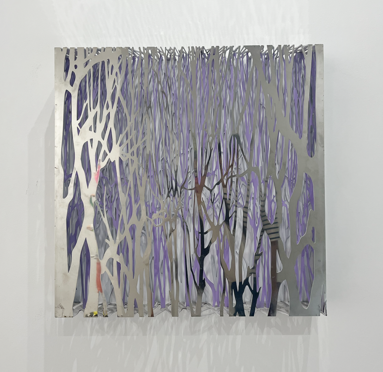
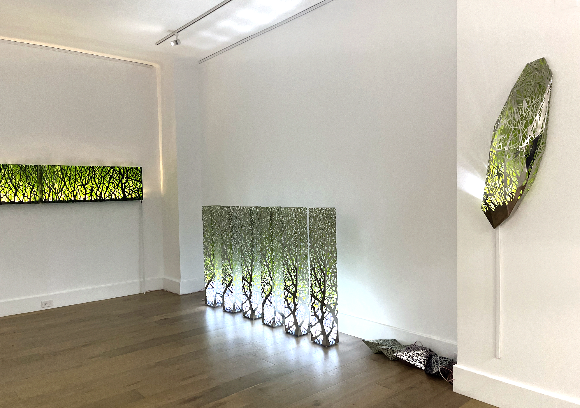
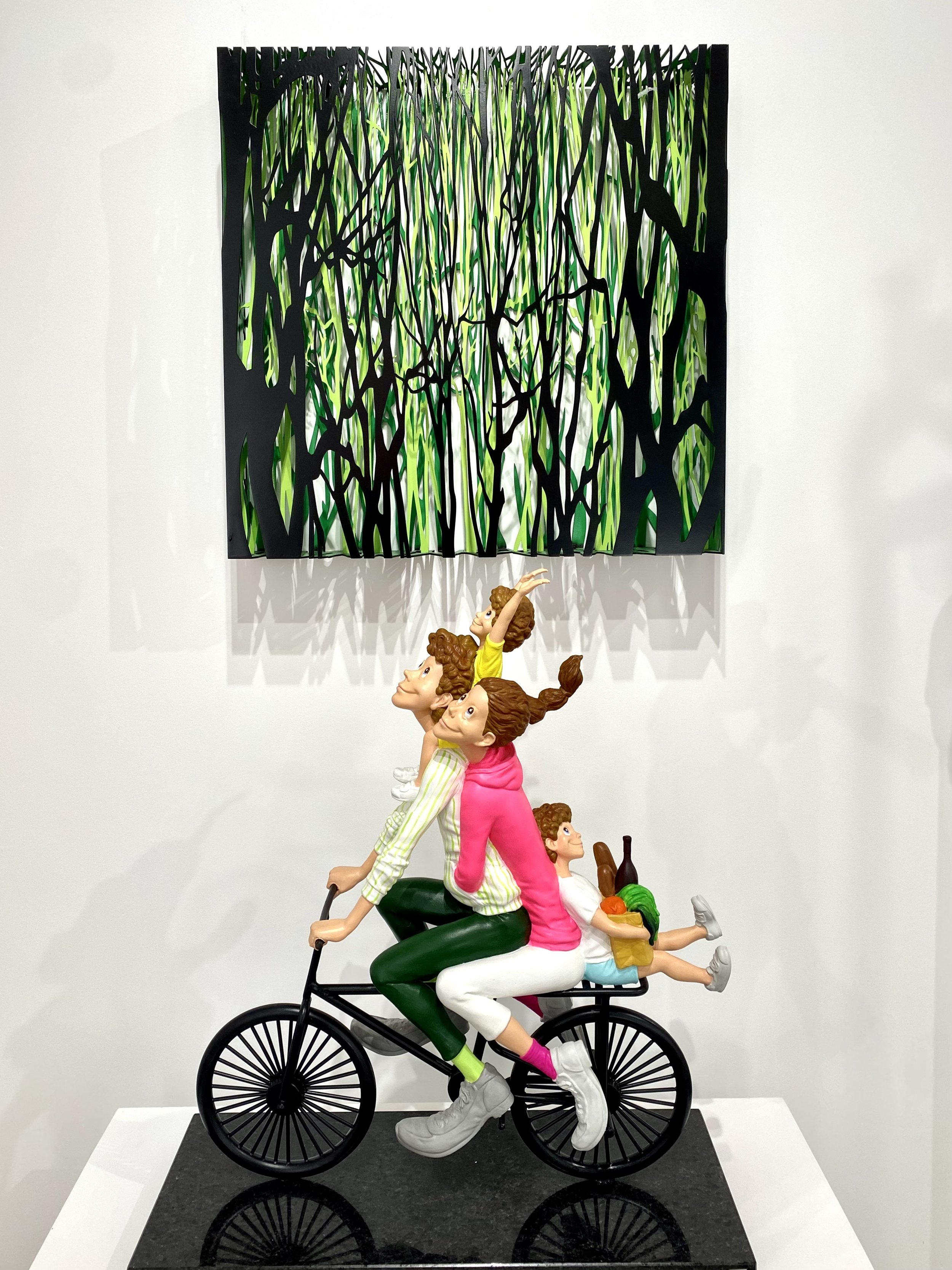
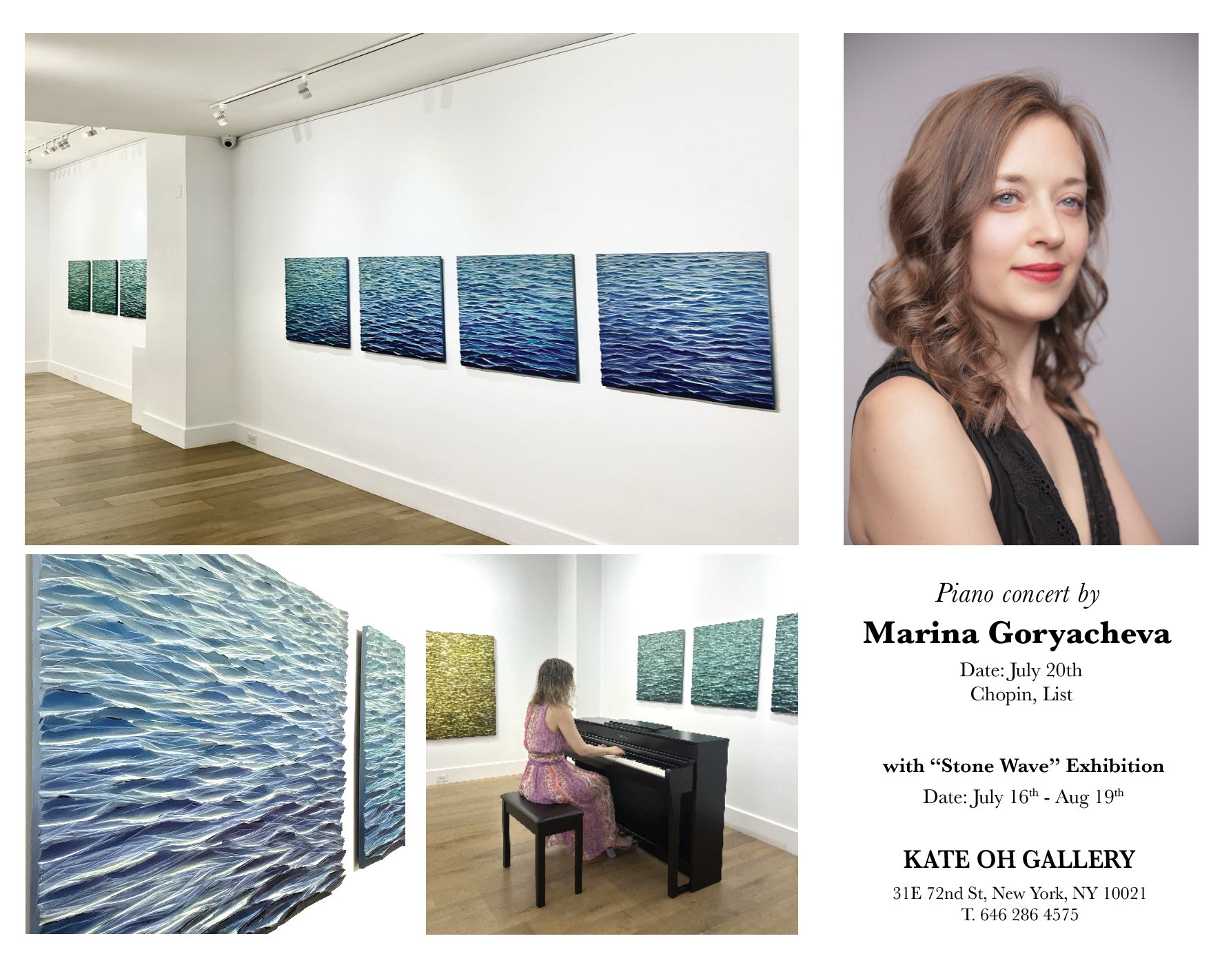
“Stone Wave”
by Jung Kwangsik
July 16 - August 19, 2023


“KIMONO REBORN” by Mayuko Okada
Exhibition Dates: May 30- June 23rd, 2023
“Tactile Effects” by Mague Brewer
Date: May 16 - 27, 2023

Rinaldo Skalamera
Exhibition Dates: April 16 - 30th, 2023

Callie Danae Hirsch
Exhibition: April 4th 15th, 2023

Moonlit Dream, Oil on Canvas 51 x 64”
“Collect Brazilian Jewelry”
Brazilian Handmade Jewelry
Exhibition Date: March 16 - April 1, 2023

“New York K-Art Festival”
Exhibition Date: March 4-12, 2023

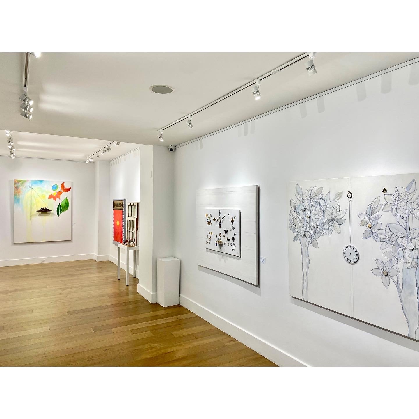
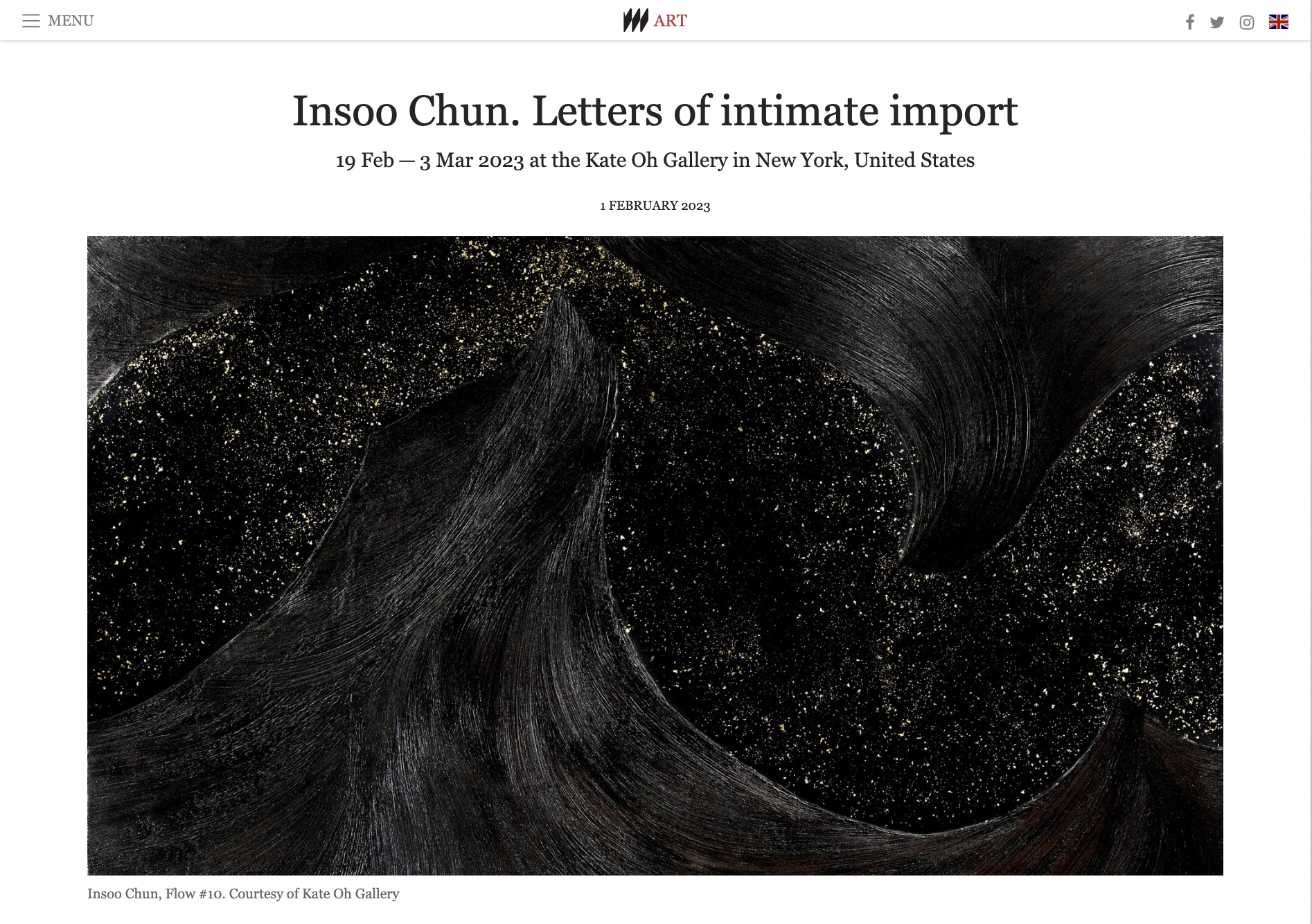
“Flow”
by Insoo Chun
Exhibition Dates: February 19 - March 3, 2023
Read More here>>>
“Lucky Charm” (Dancheong)
by Kate Oh Trabulsi
Exhibition Dates: Jan 21 - 31, 2023

“Emptying and Filling”
by Kwan-Jin Oh
Exhibition Date: January 3-20, 2023


UES Minhwa (Korean Folk Traditions) Exhibition
Exhibition Date: Dec 20-30th,2022
Reception: Dec 23rd, 3-6PM


“Populist Animals”
by Heemin Moon
Exhibition Date: Dec 6-18th, 2022
Reception: Dec 6th, 6-8PM

https://www.meer.com/kateohgallery/en/news/71541
“INFINITELY REPELLING ORBS”
by Marko Stout
Opening: Dec 1st, 2022


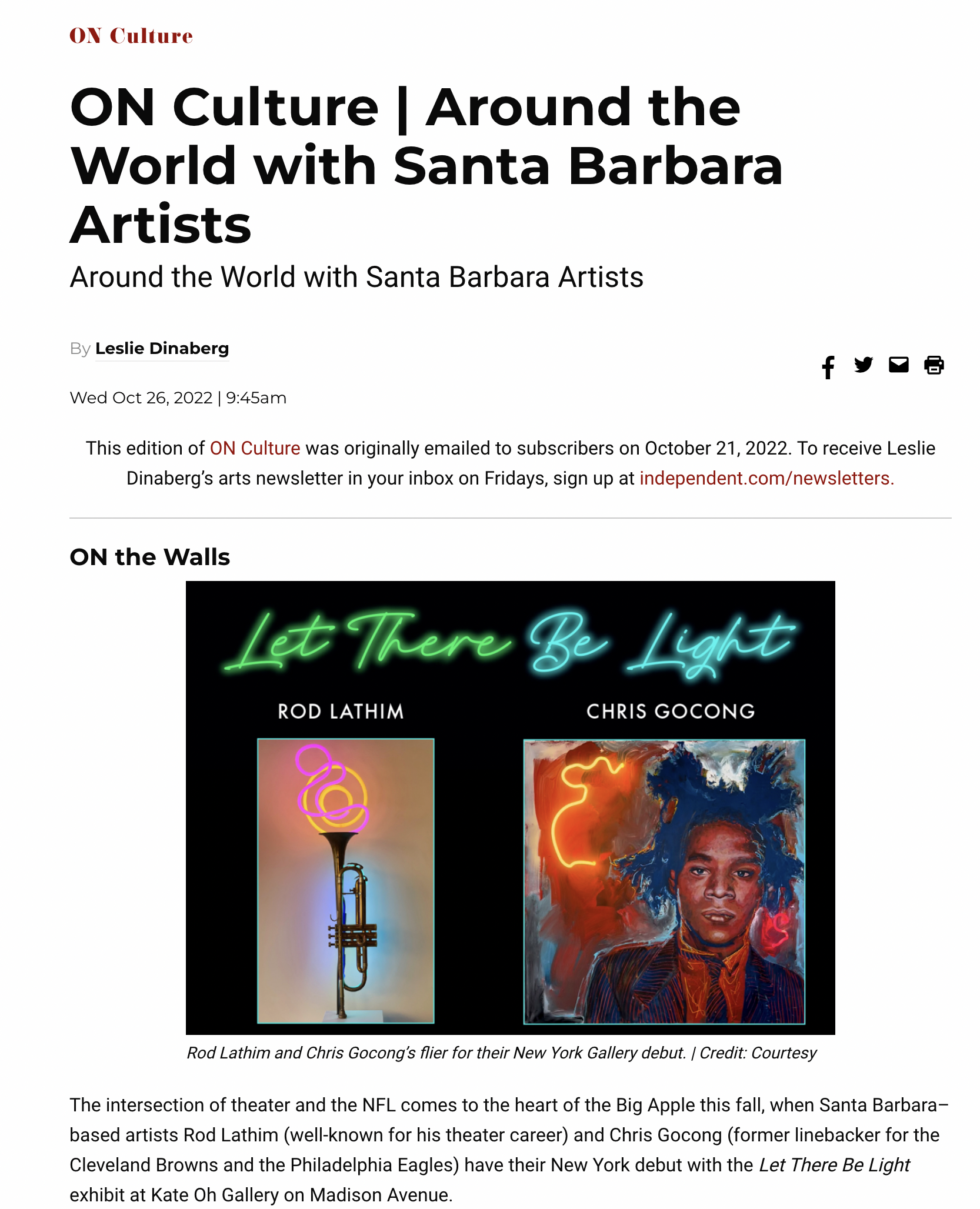
“Let There Be Light”
by Chris Gocong and Rod Lathim
Exhibition Dates: Nov. 3-25 2022


The talented artist Anely Girondin who exhibited at Kate Oh Gallery from
August 28 - September 4, 2022
was featured on NY Daily News.
Read more on her work and this article here.

“Dusted Photographs”
by Peter Ha (Jaeyell)
Exhibition Dates: Oct. 20-30, 2022


"Serendipity”,
showcasing dramatic abstract works by artists
Angels Grau and Alberto Murillo
Exhibition Dates: October 2-8, 2022
An Artist Who Paints From the Heart: Yang SiYoung
Exhibition Dates: September 26 - October 1, 2022

“Expressionist Scenes of Harrow”
by Nancy Prager
A collection of 'configurations' suggesting and mirroring haunting messages.
Exhibition Dates: September 6 - September 23, 2022

“The Movements of Our Roots”
by Anely Girondin
Exhibition Dates: August 28 - September 4


“Matrixes Small Works”

“HYPNOTIQ”

“The Pursuit of Happiness”
“The Lost Flame, Regained”

“ Cancer Fundraiser Show”

“Cancer Fundraiser Show” by Richard Volpe, Eliza Bender, and Alyssa Giammona.
Exhibition Date May 19 - 29, 2022
Closing Reception : Thursday May 26, 6 - 8 PM
Kate Oh Gallery is participating in the Madison Avenue Spring Gallery Walk on Saturday, May 14th, 2022. We cordially invite you to join us at the artist talk at 2 PM.
You can RSVP here: https://madisonavenuebid.org/springgallerywalk/
In this Gallery Walk, artist Bong Jung Kim's solo exhibition, Convalescence, will be on view. We invite you to his world of art and creativity merged with salutary perspectives.
"Convalescence”

"Convalescence"
by Bong Jung Kim, curated by Iris Inhee Moon
Kate Oh Gallery invites you to a Bong Jung Kim’s world of oriental philosophy merged with western aesthetics. Kim’s art explores a philosophical relationship and quest to the subject matter of love, desire, and longing, bridging the gesture and expression of his body and soul.
“TO BECOME LIFE": Two-Person Show
Irina Rodnikoff, Transition I

Miroslav Duzinkevich, Musicians
“Love Walk in New York”

Rainbow Group Show

Pema Rinzin, Peace and Energy (Yellow), 41 x 61 in.

Lori LaMont, La Premiere, 51 x 72 in. (framed)
"The Korean Archetype”

"The Korean Archetype" by Miky (Yoohyun) Kim at Kate Oh Gallery
Exhibition Date: March 1 -11, 2022


“Pop Art Figures: Present and Past”


Bong Jung Kim, Poppy Series
Encore Show: “Flower Dance”

#2 Flower Dance_64 x 52 inch _Mixed media_2021
Rosalyn Engelman

“Immortal Poets” 78 x 80 in, Acrylic on canvas
Pietro Antonio Narducci (1915-1999)


“Stone Wave”

51.2 X 23.6 X 0.79 in
“REQUIEM”

“Flower Dance”

“Flower Dance” by Bum Hun Lee Mixed Media, 2021 Size: 116.92 X 59.05 Inch
“Healing in City”
First Exhibition in our New Location

“America The Beautiful”

In the Present Tense

Iliya Mirochnik, By the Channel

James Sondow
by James Sondow and Iliya Mirochnik
The Birth of Oopsy and Oopsy

Elementals

Temptress, 2016, 60 x 48 in.